This work received a Silver ADDY Award at the 2026 American Advertising Awards hosted by AAF.

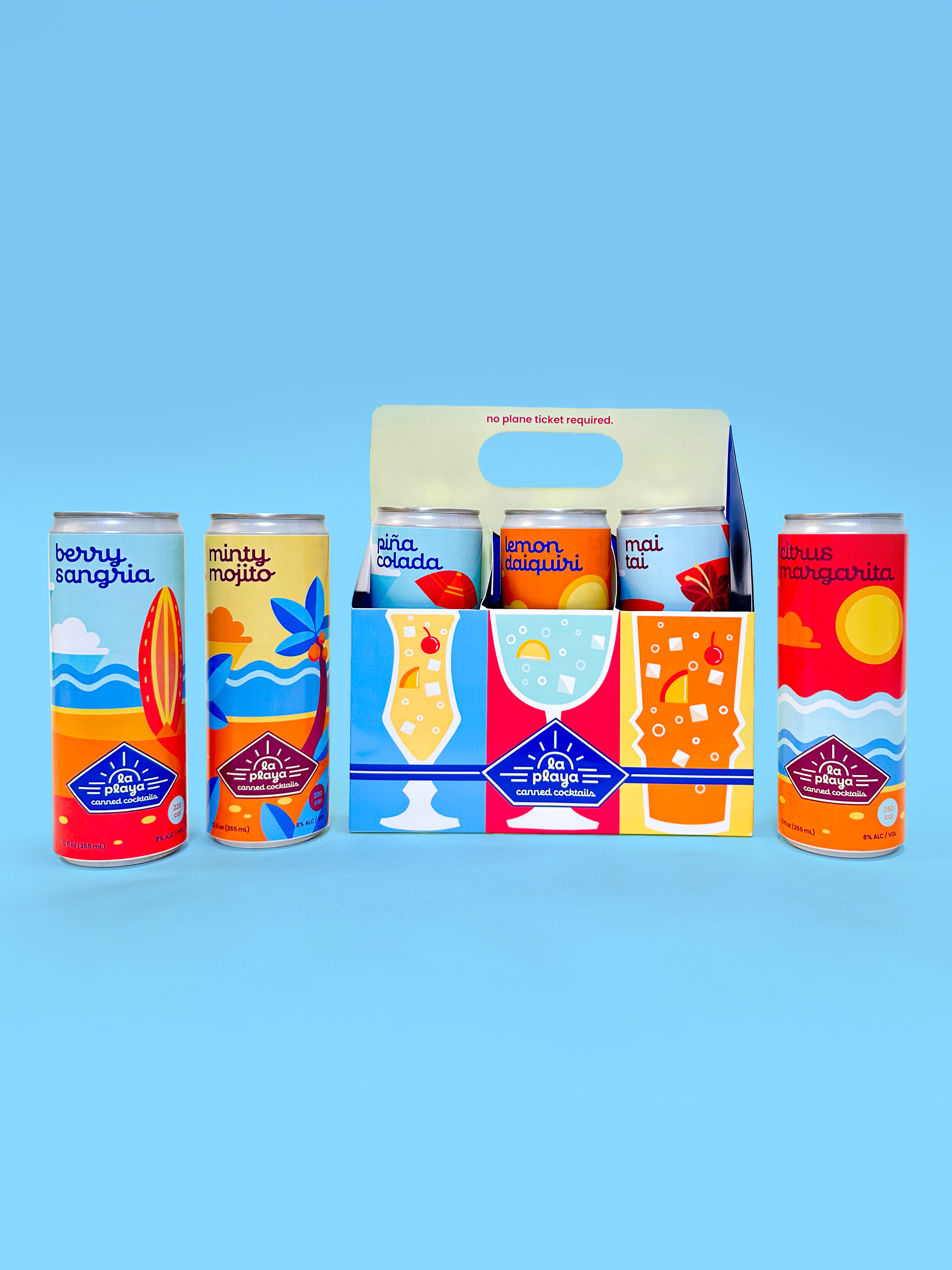
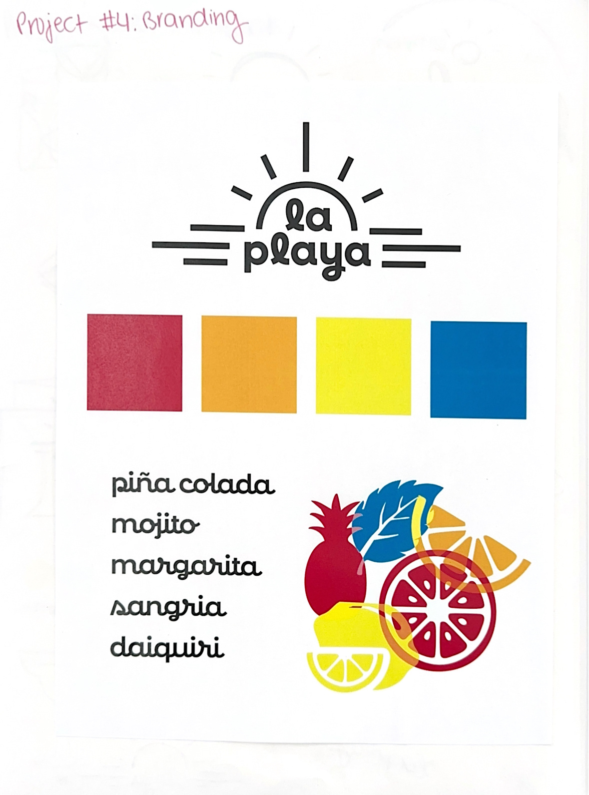
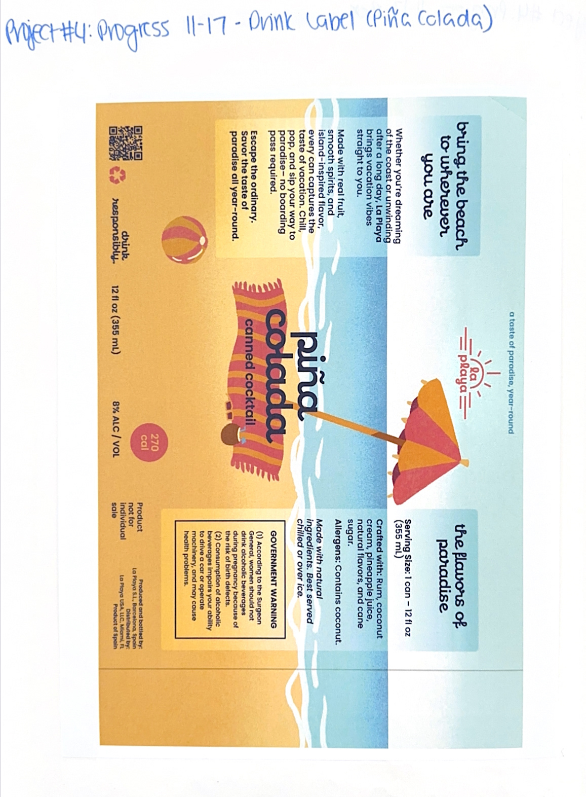
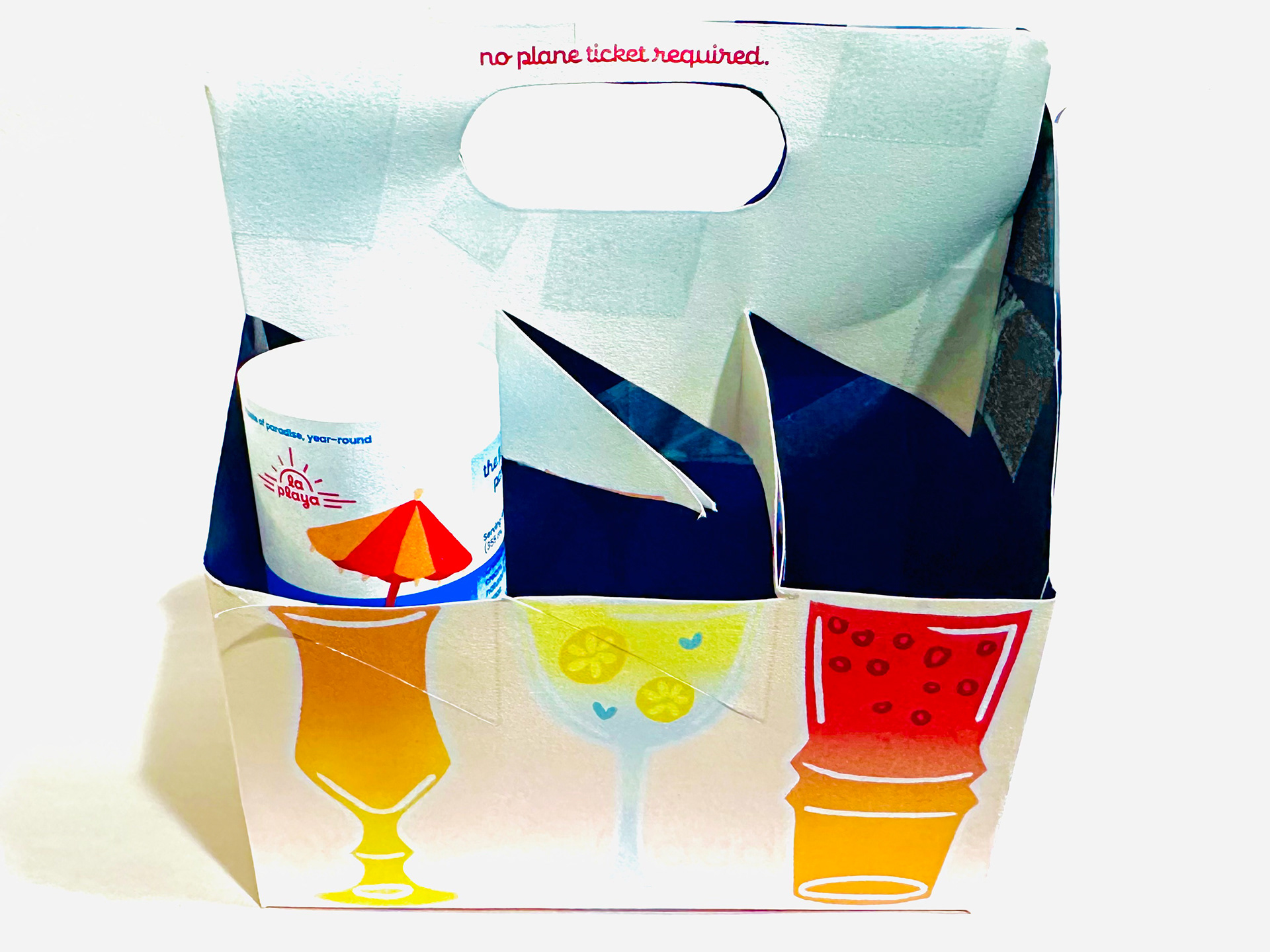
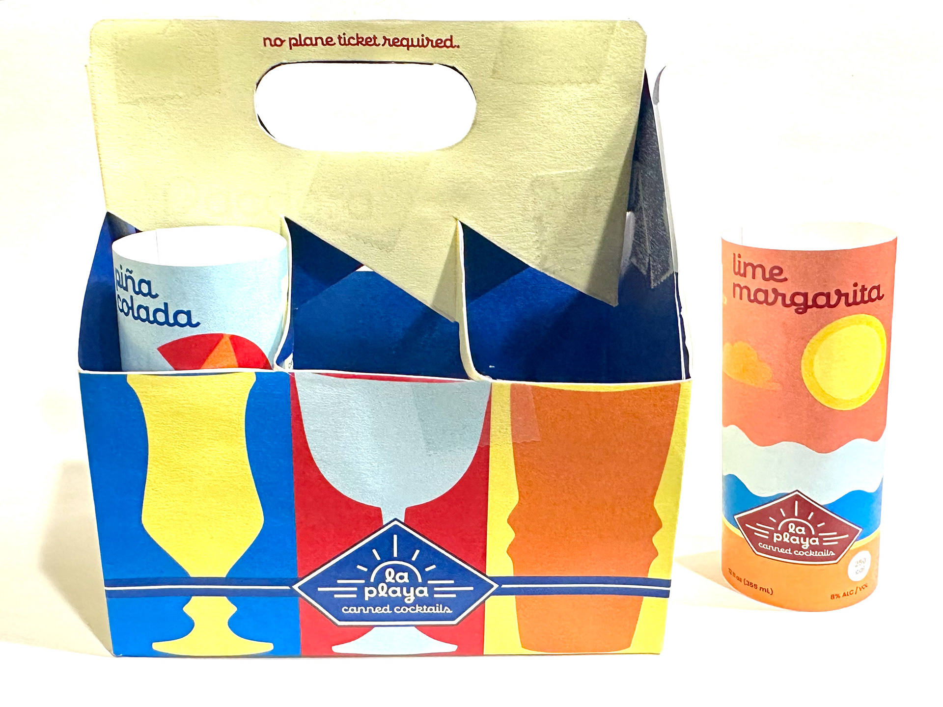
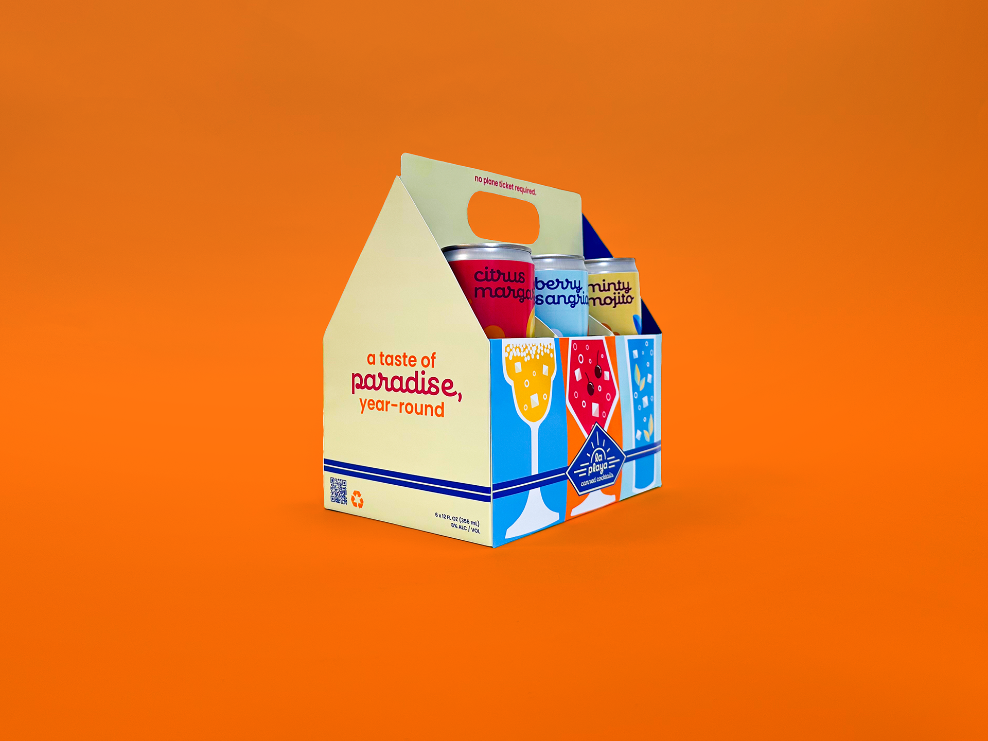
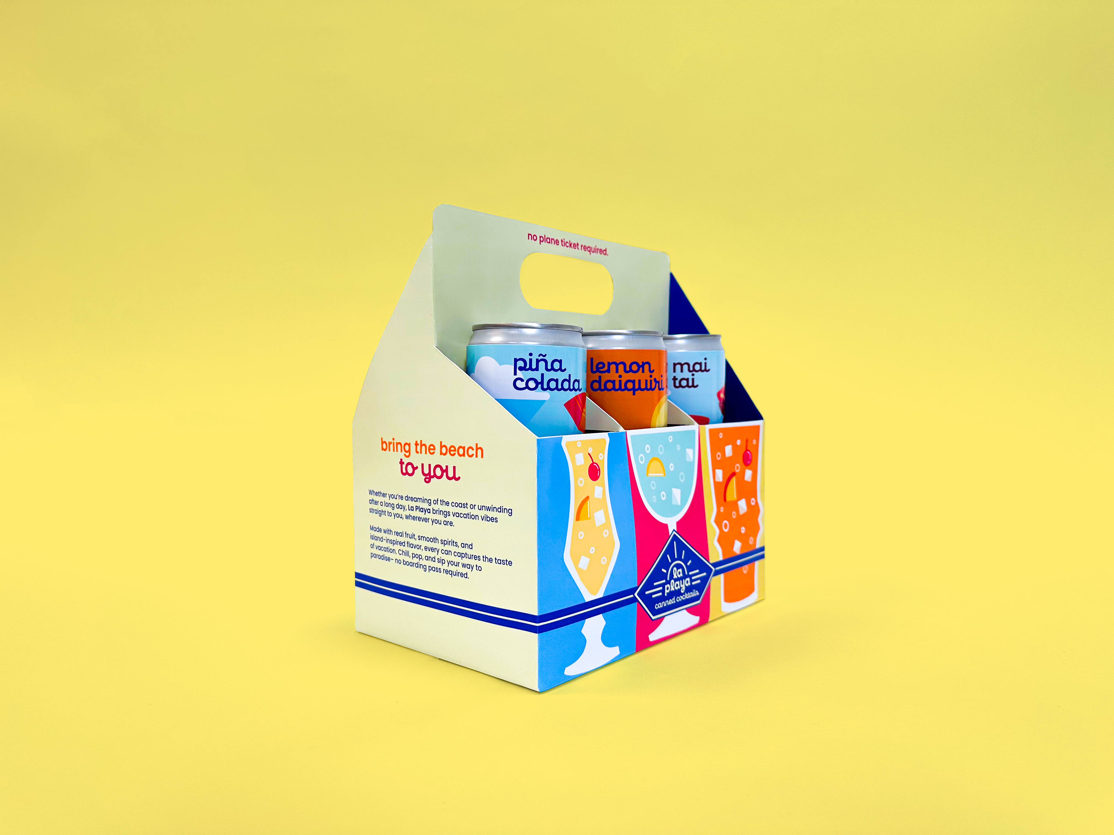
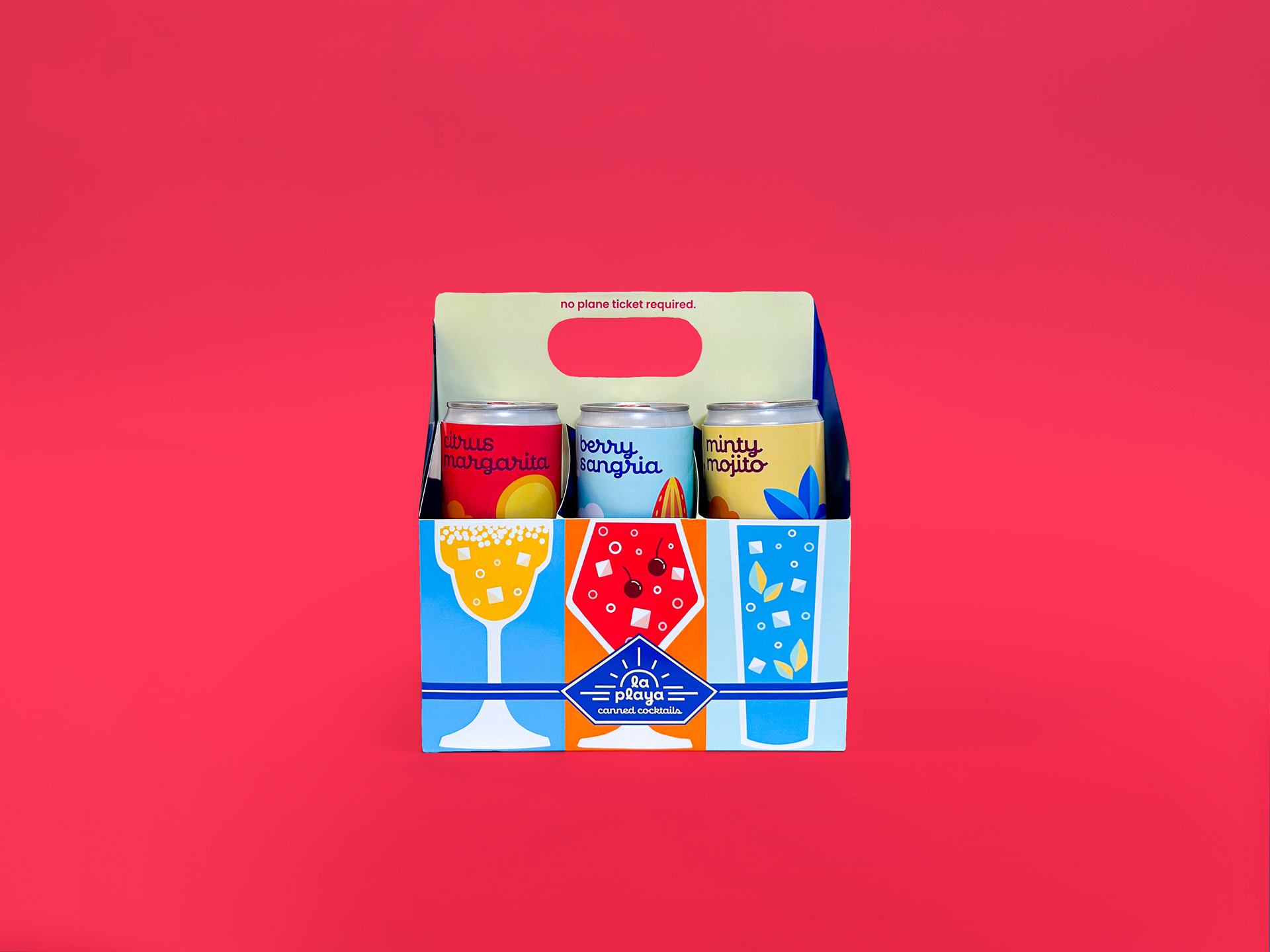
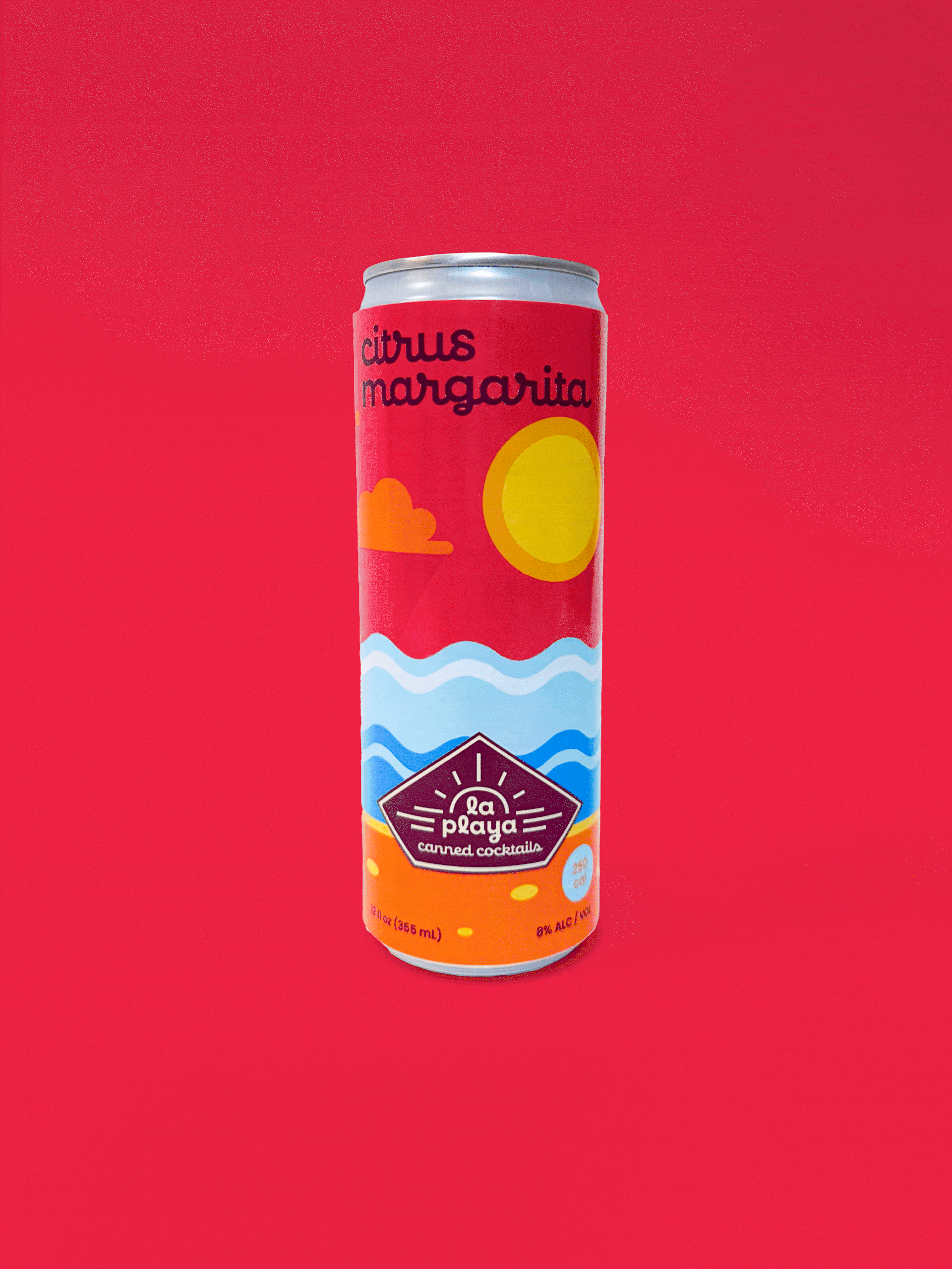
La Playa is a canned cocktail brand designed to bottle the feeling of an endless summer. Inspired by the warmth of the beach and the easygoing spirit of vacation, La Playa brings paradise to you– no flights, no planning, no packing required. Each flavor is crafted to capture the bright, refreshing, sun-soaked vibes of the shoreline, offering a taste of escape with every sip. Whether it’s the middle of winter or you’re simply craving a moment of relaxation, La Playa delivers the beach experience in a can, letting you sip your way into vacation mode year-round.
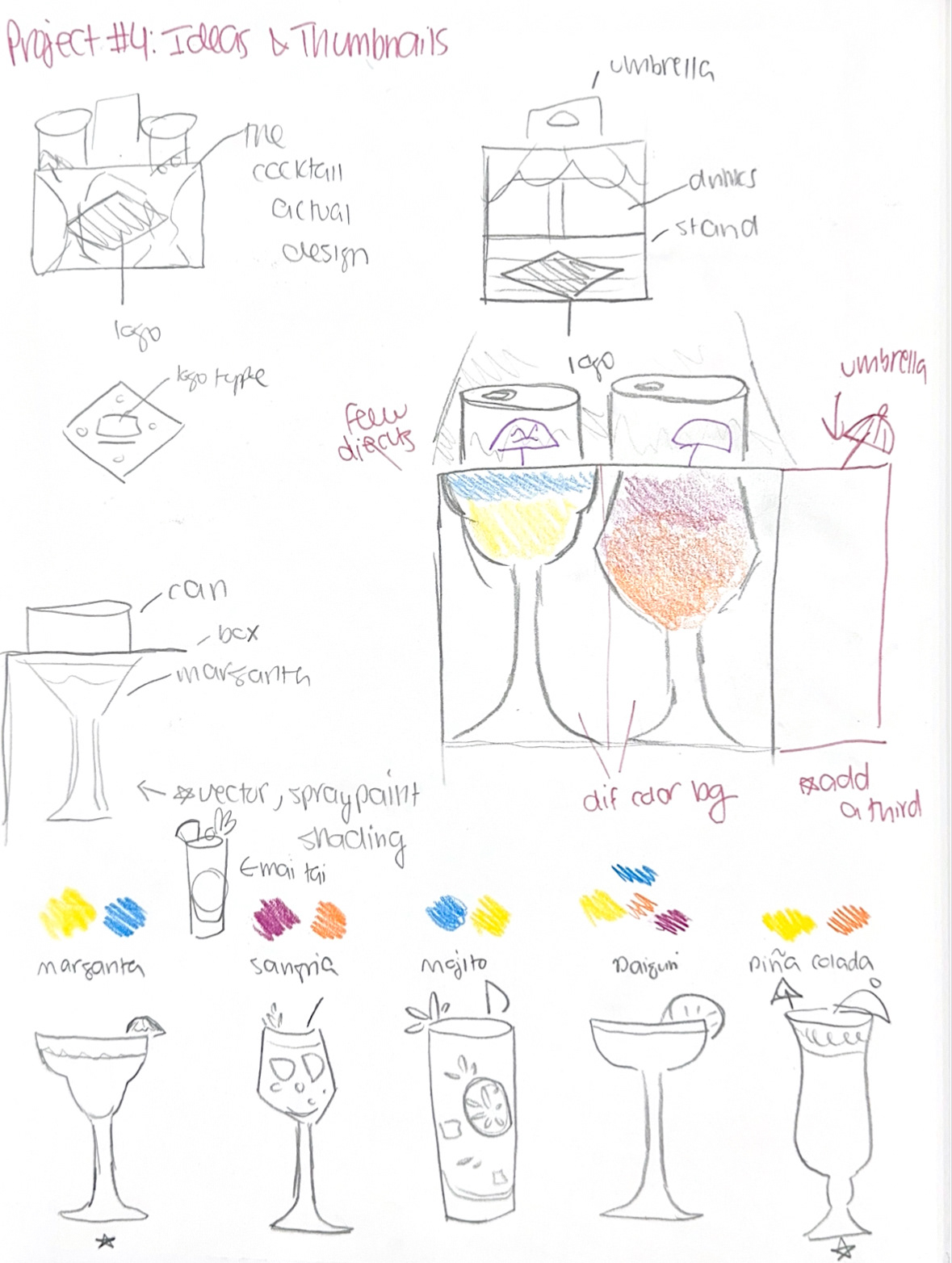
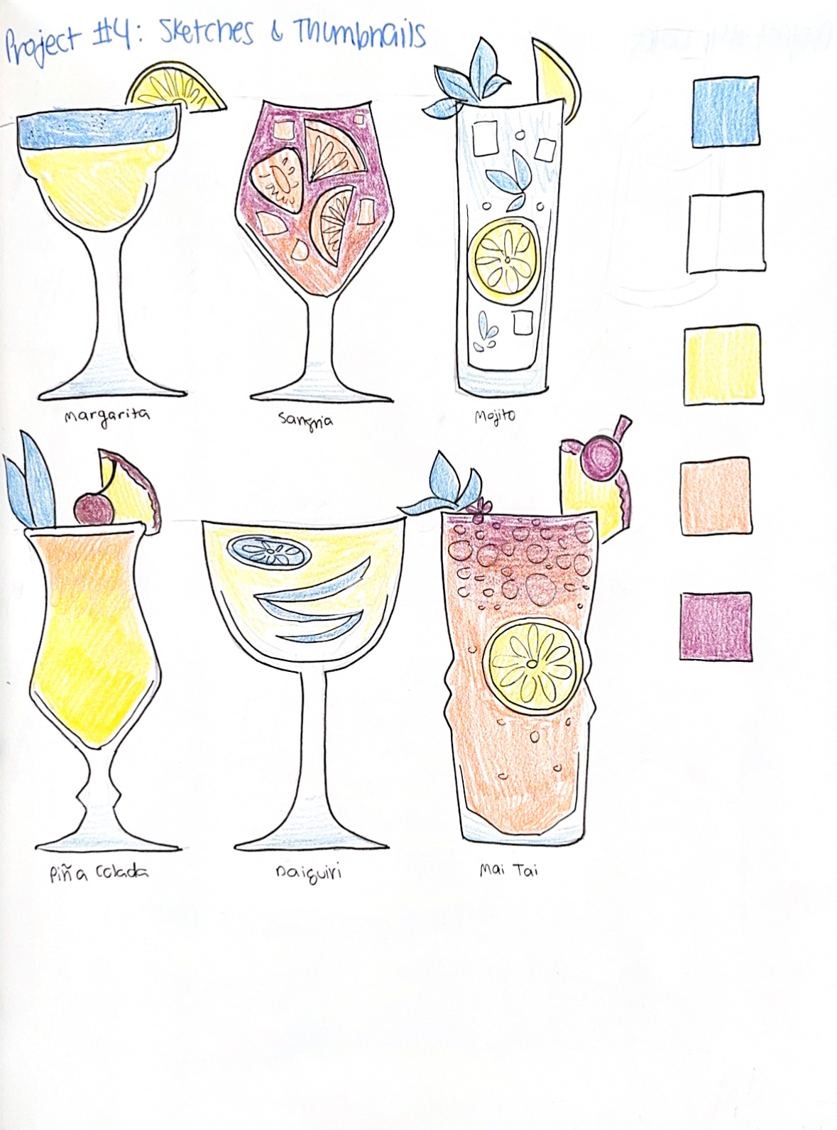
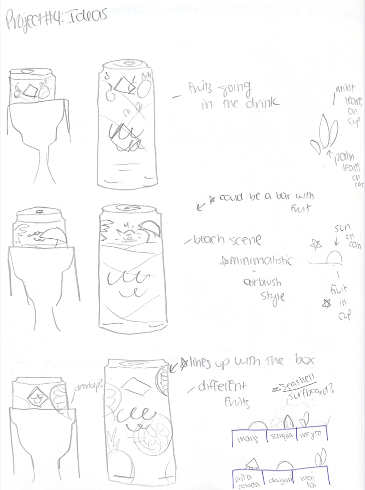
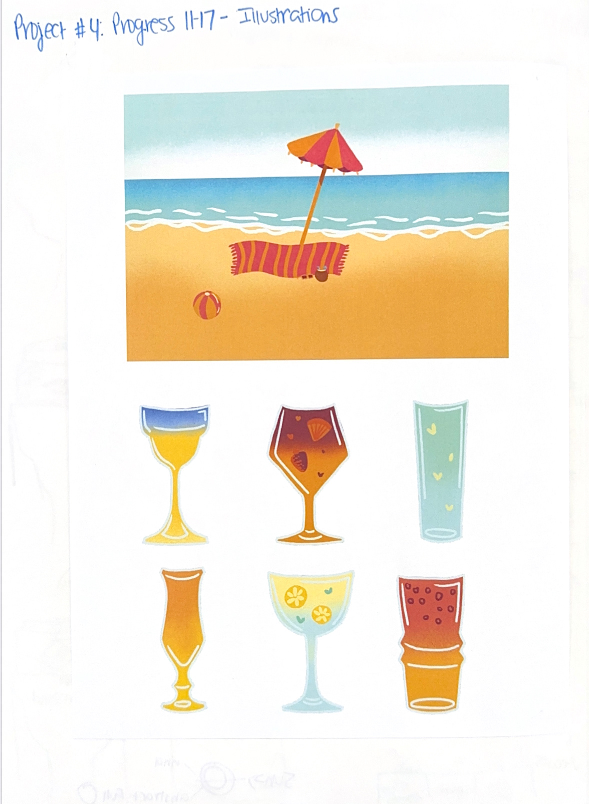
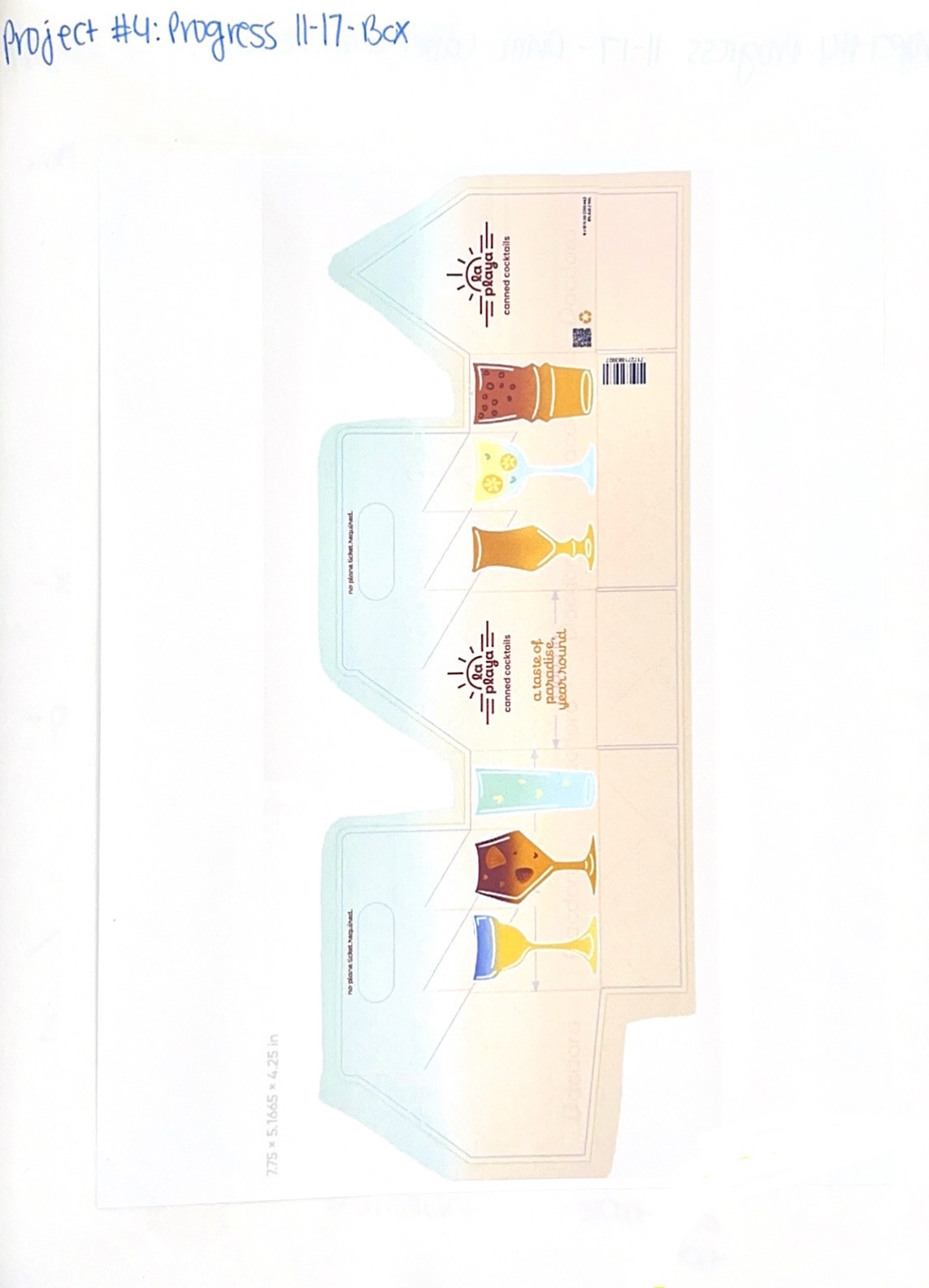
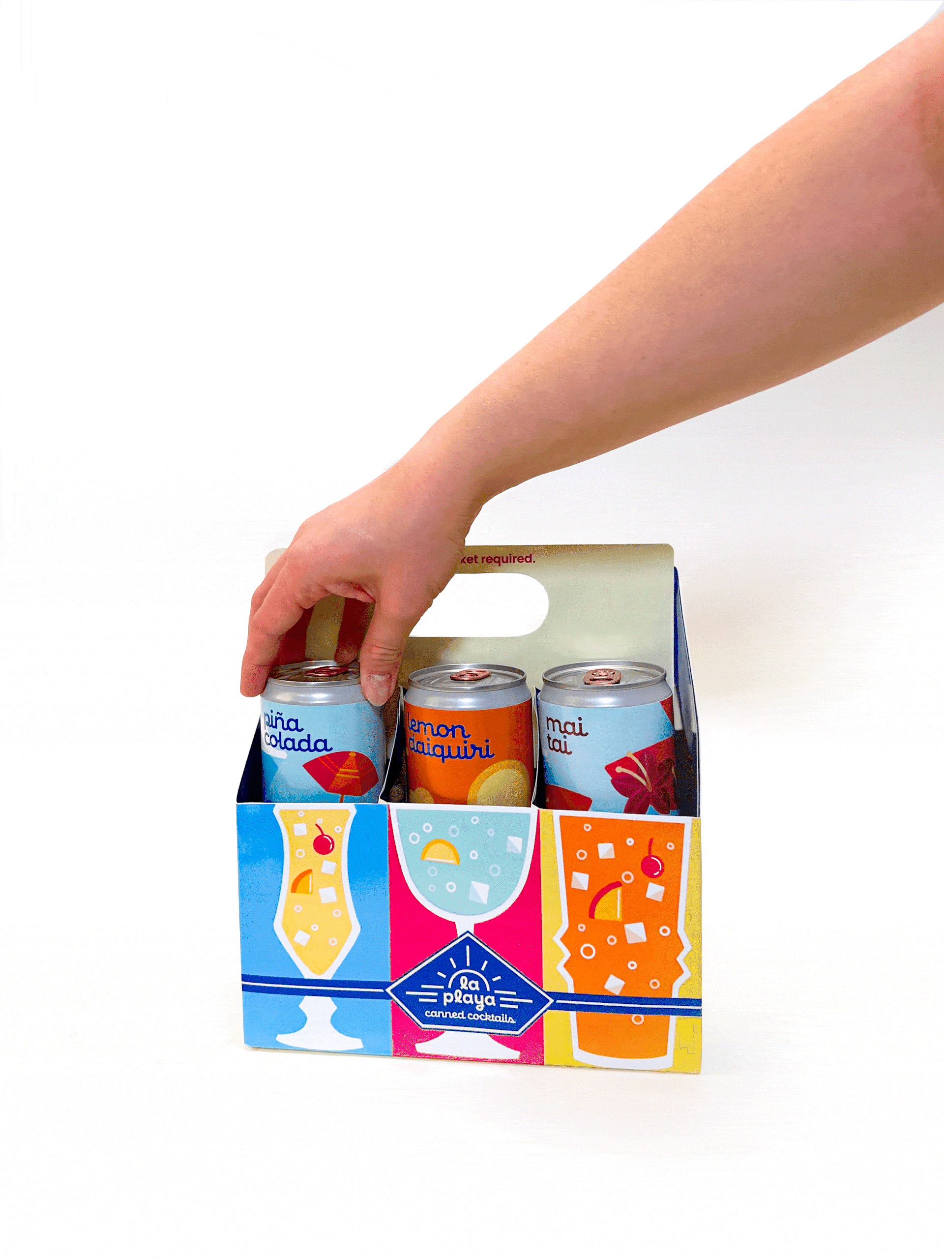
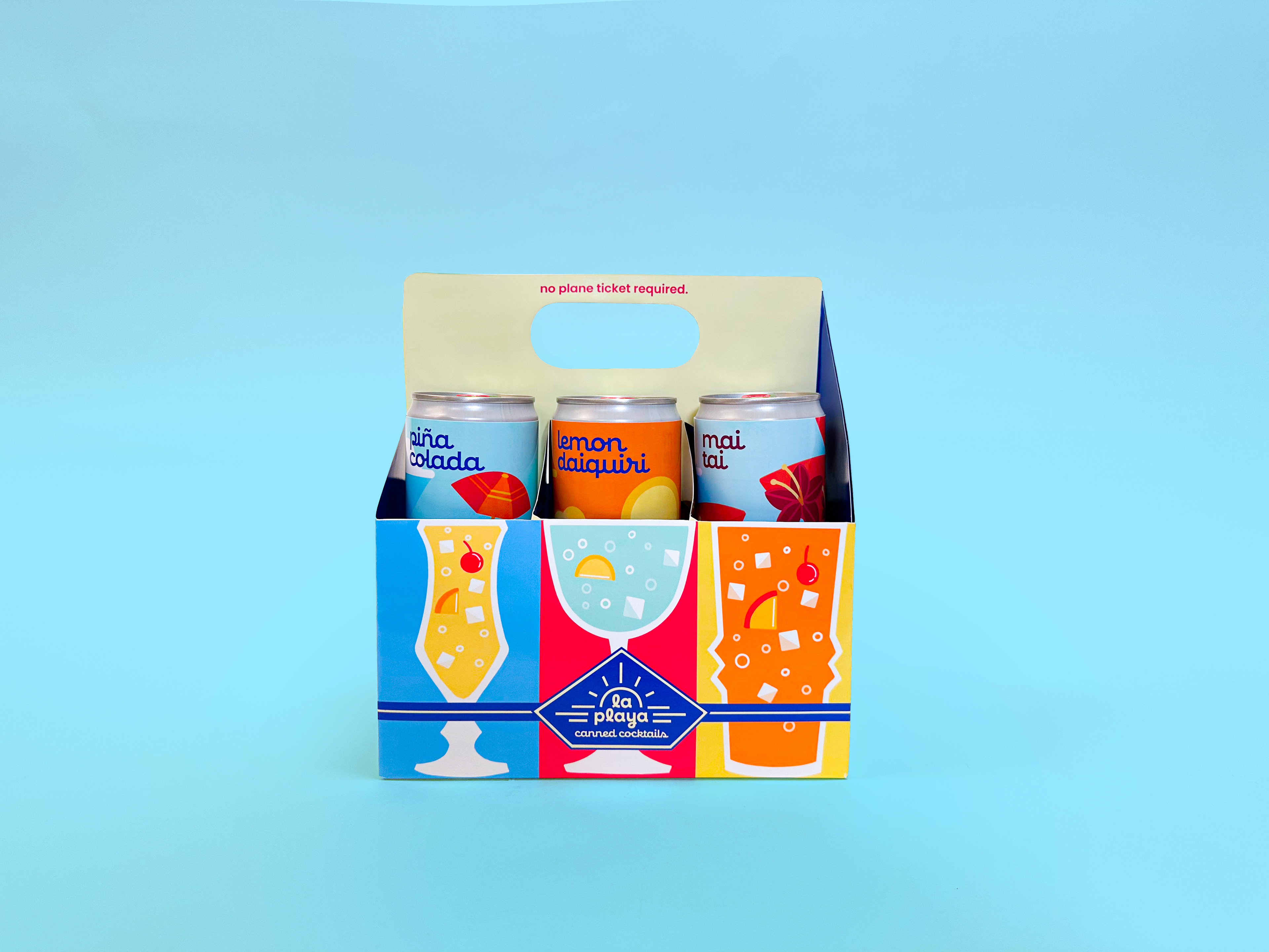
One of the most distinctive elements of the La Playa packaging system is the playful interaction between the box and the cans. The box is designed with illustrated cocktail glasses on the front, while the can inside features a tropical icon that doubles as the drink’s garnish when it peeks out above the box edge. For example, the sun illustration becomes a slice of lemon on the daiquiri glass, the mint leaf for the mojito transforms into a palm tree, and the piña colada’s umbrella turns into a beach parasol. These dual-purpose icons create a visual bridge between the beach theme and the cocktail itself, adding a layer of discovery and delight for the customer. It’s a small hidden moment that rewards curiosity, reinforces the brand’s playful personality, and makes the unboxing experience feel thoughtful and memorable.
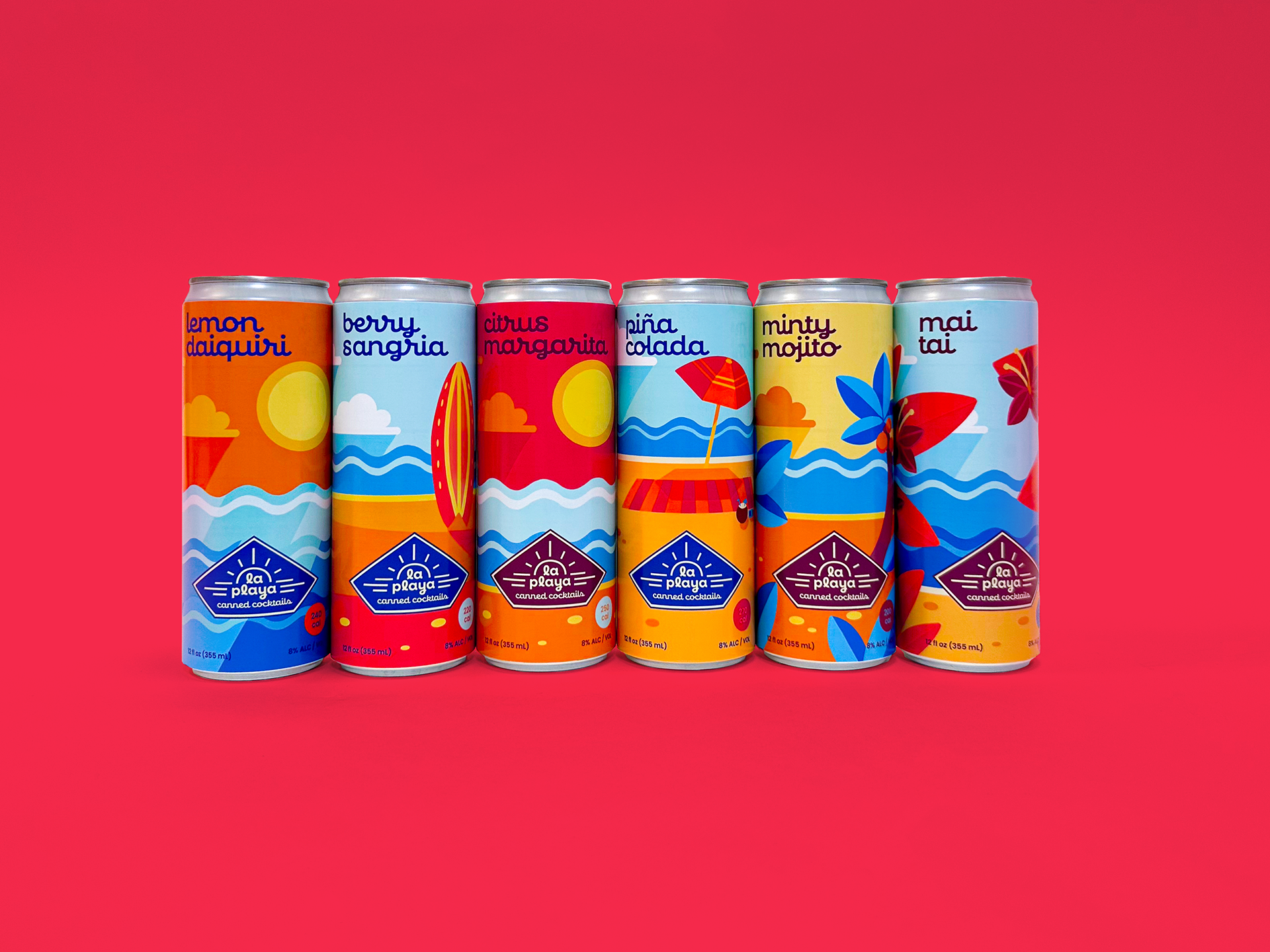
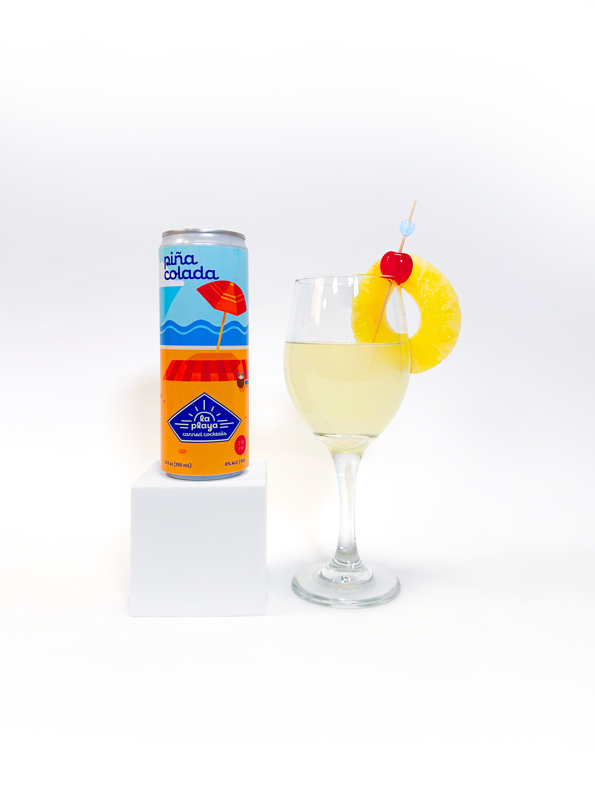

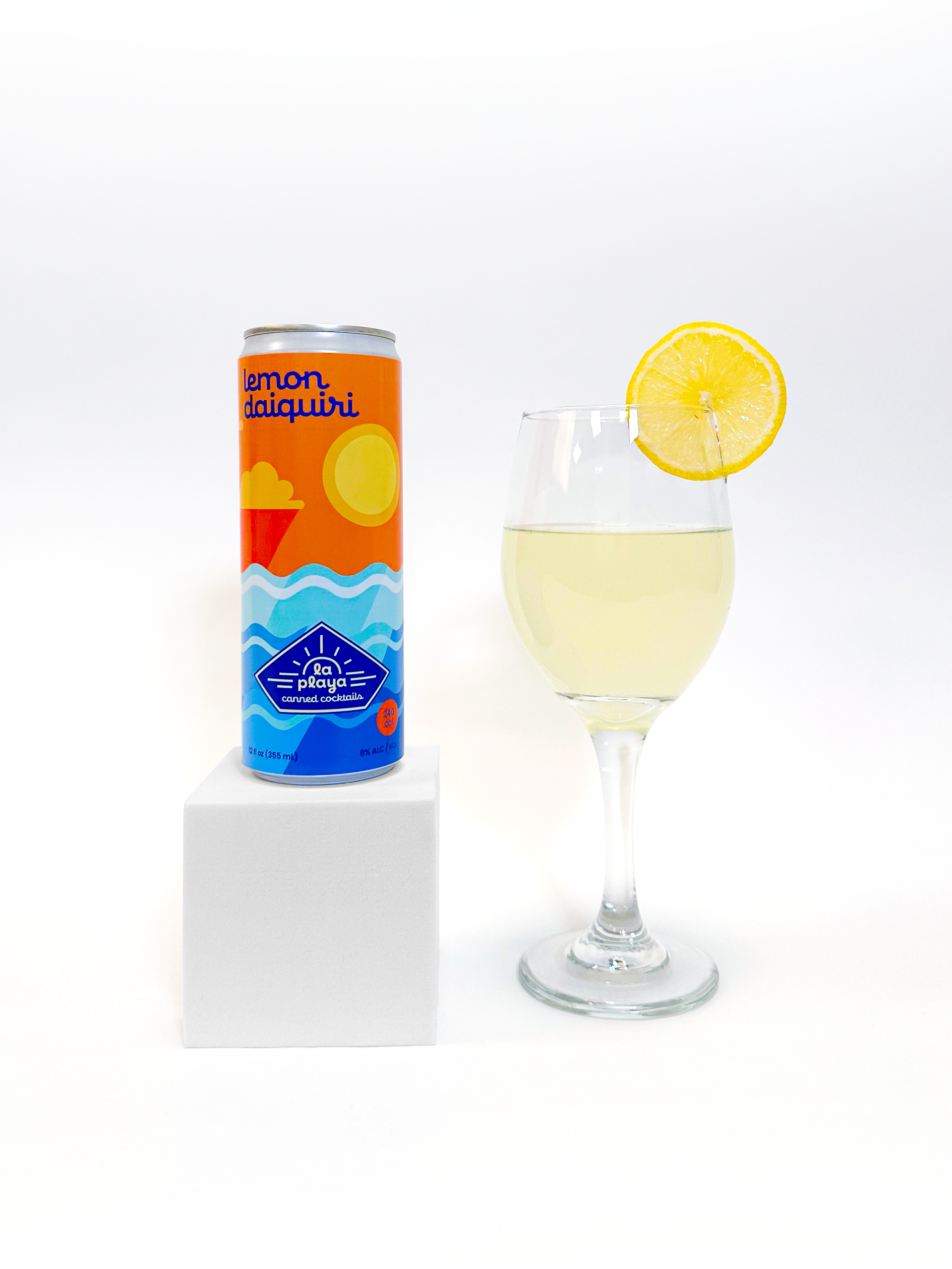
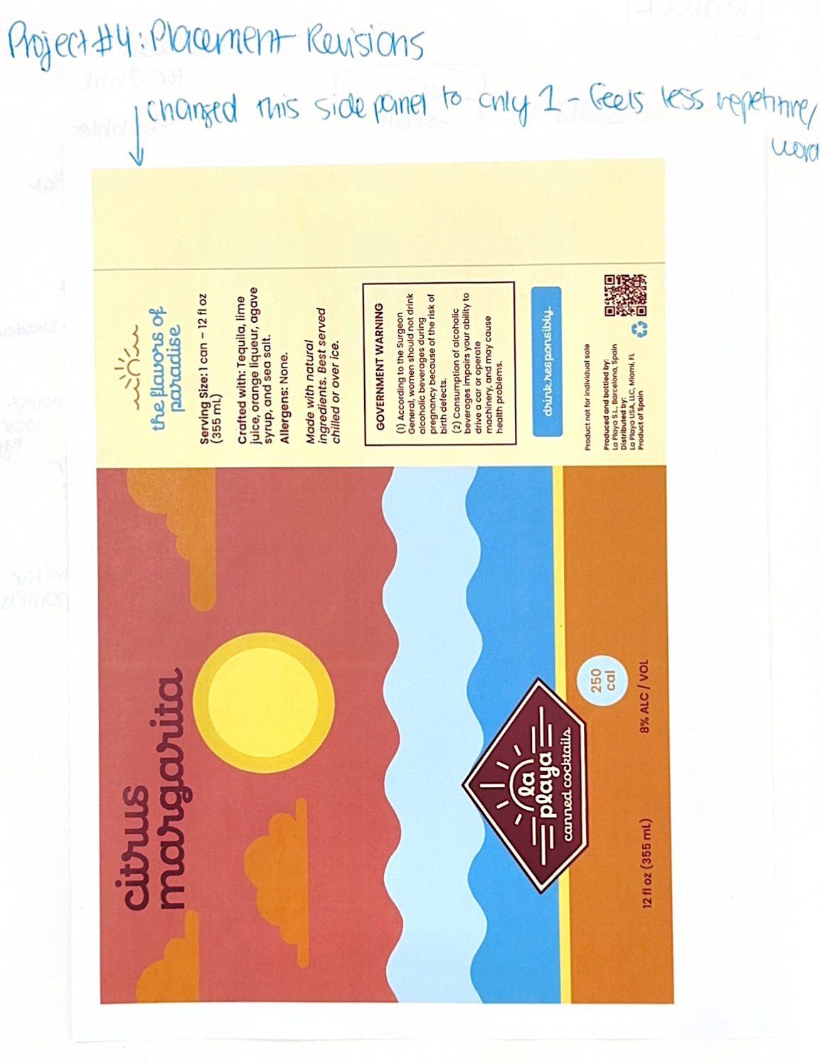
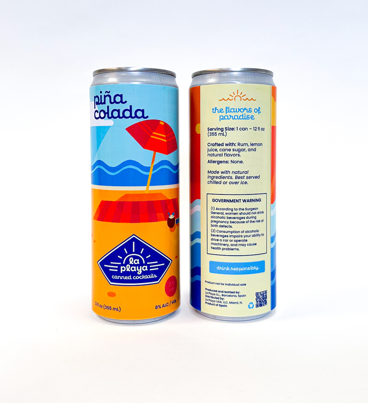
The design of La Playa embraces a bright, vibrant color palette to create an instantly eye-catching, tropical feel that reflects the brand’s carefree, beach-inspired personality. Each can features clean, vector-based illustrations that bring a modern, polished look while still capturing playful, summery energy. The typography pairs a lively, expressive script with a rounded, bold sans-serif typeface, creating a balance of fun and clarity. This combination of color, illustration style, and type gives La Playa its distinctive visual identity– fresh, modern, and full of island-inspired warmth.
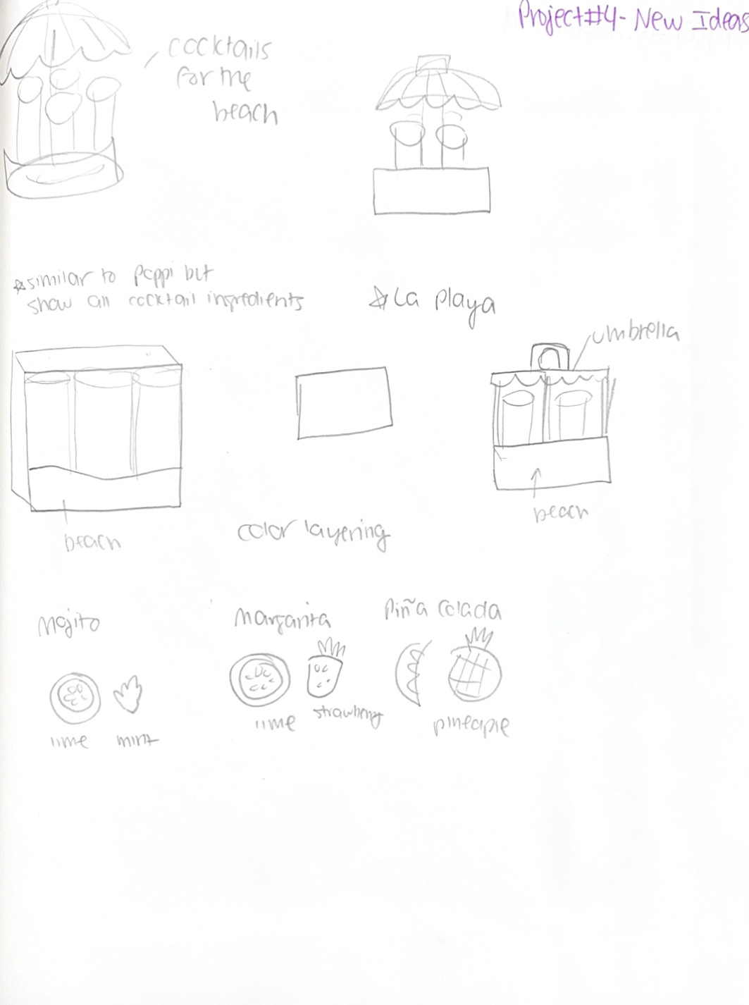
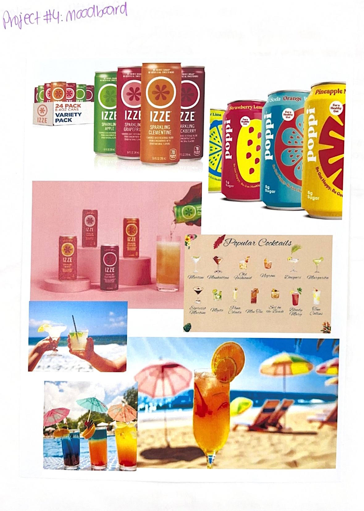
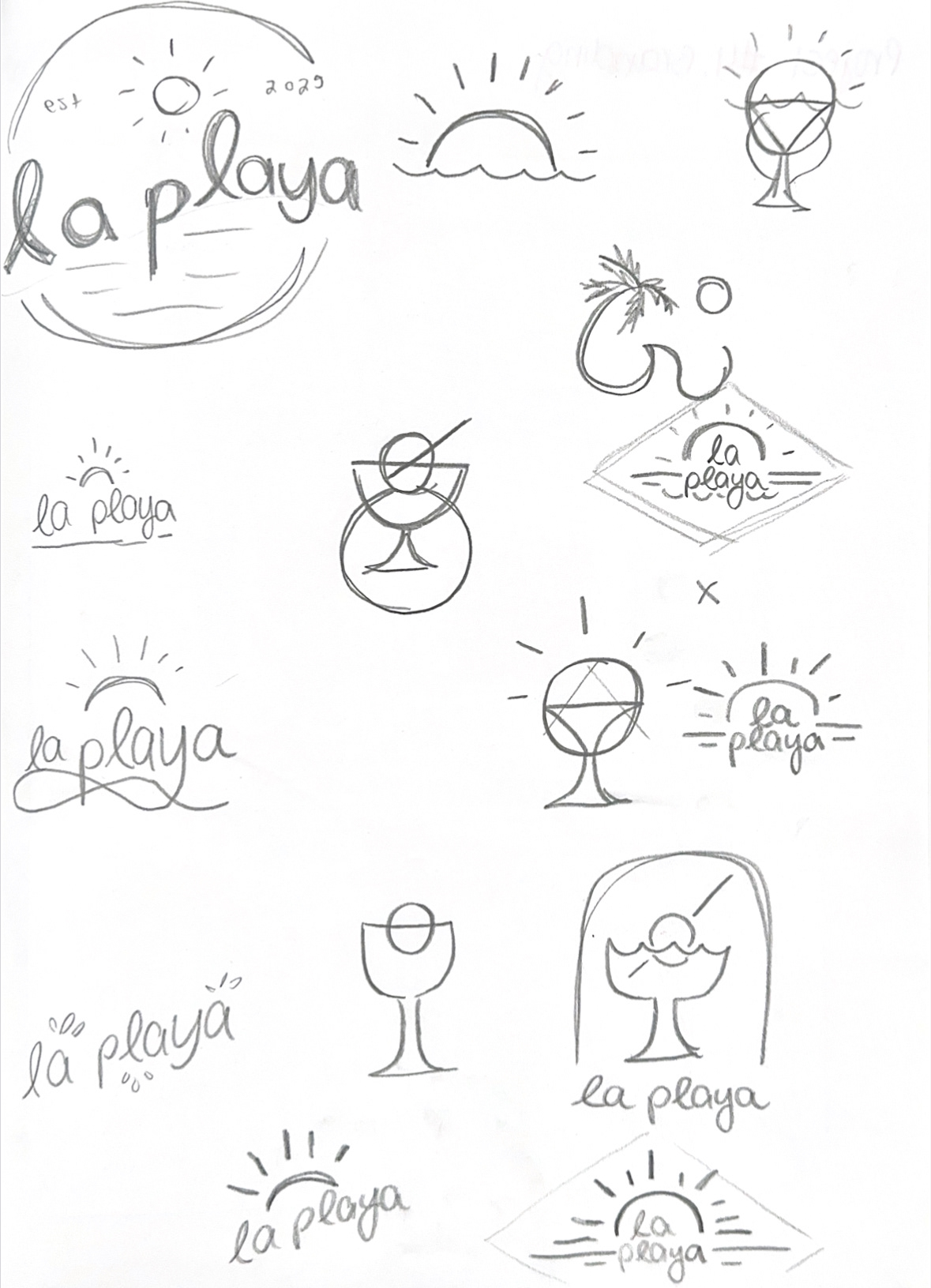
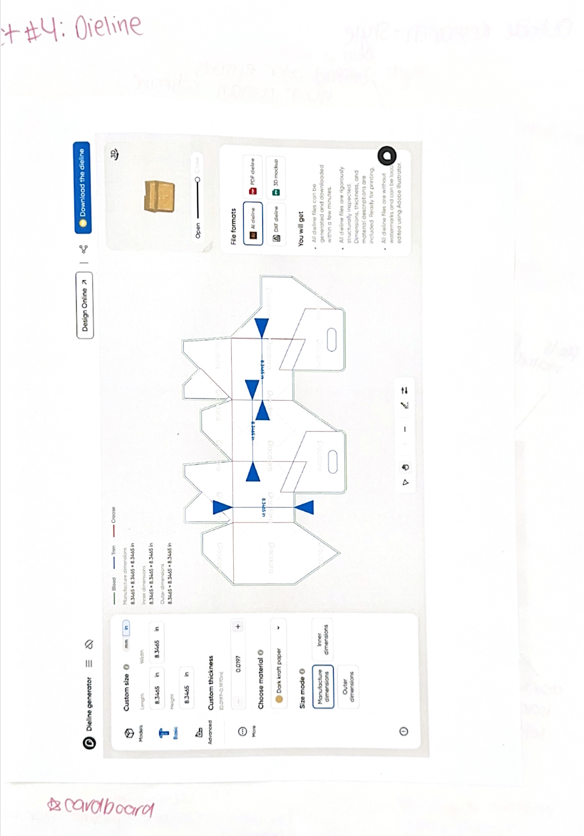
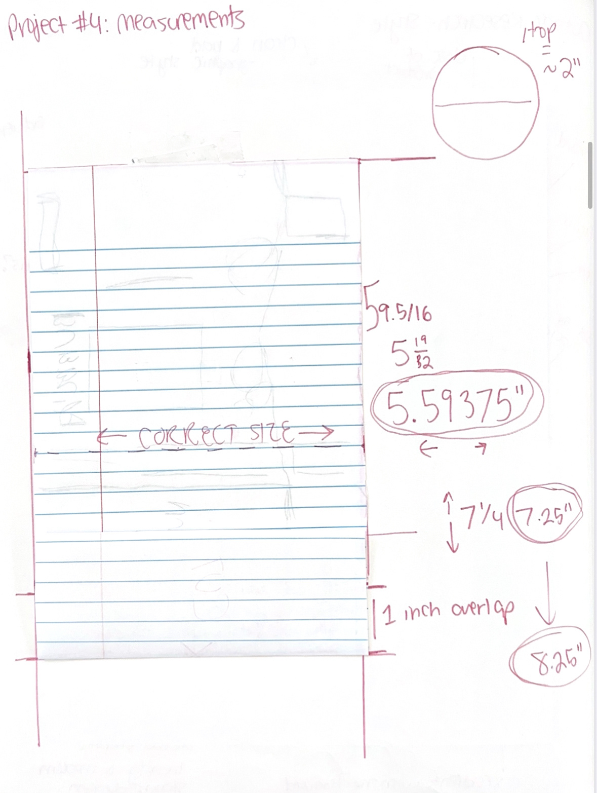
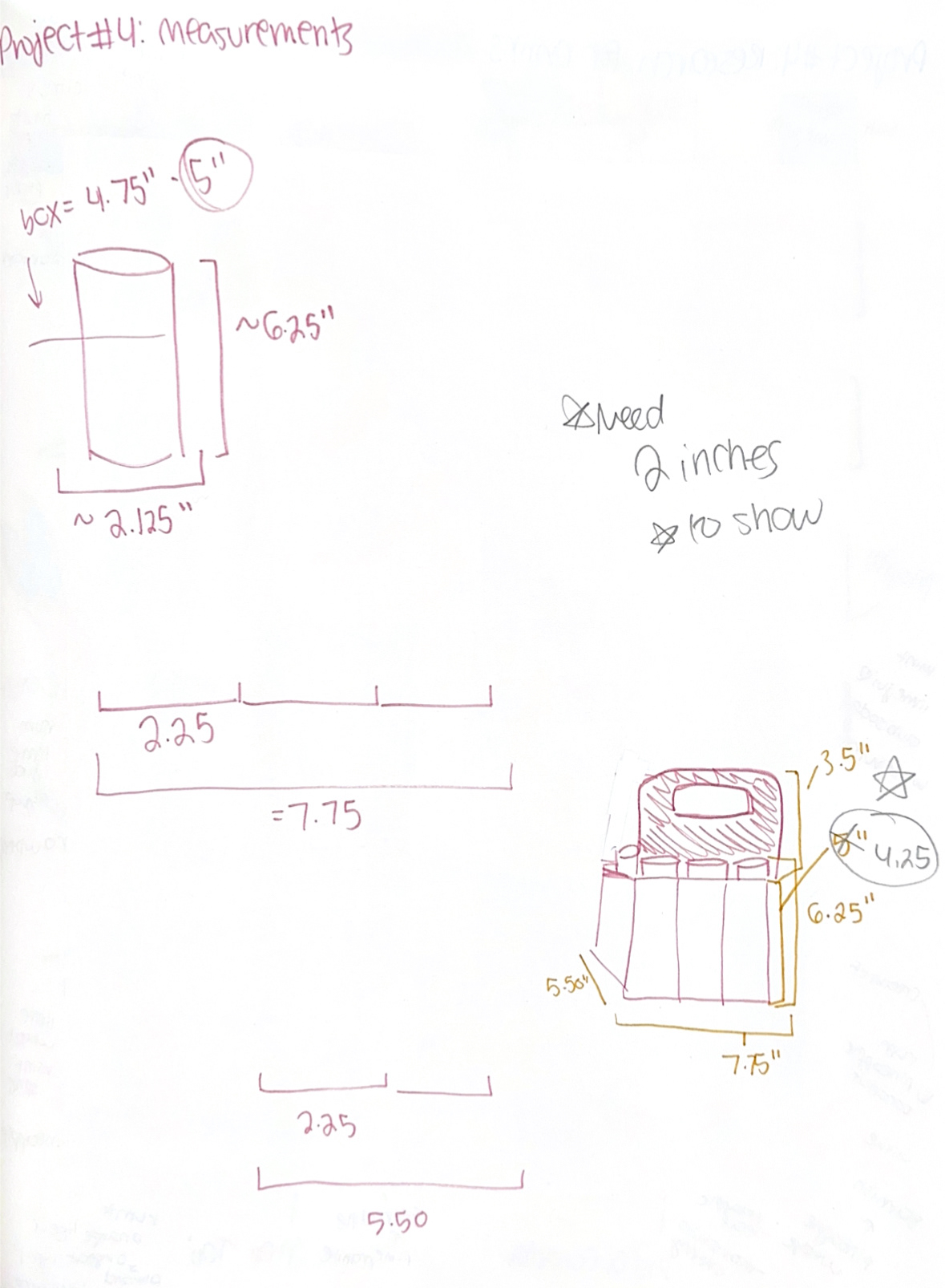
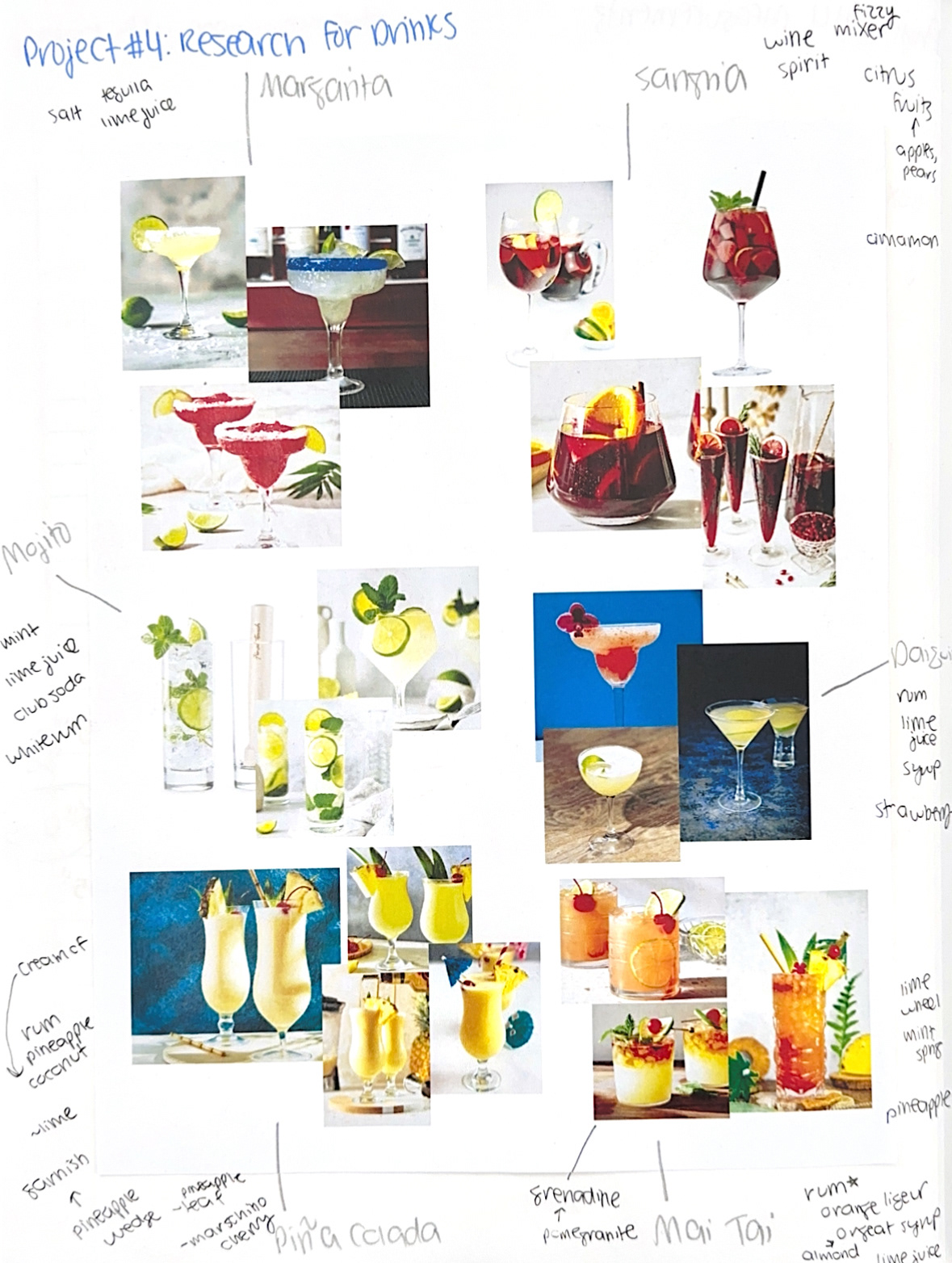
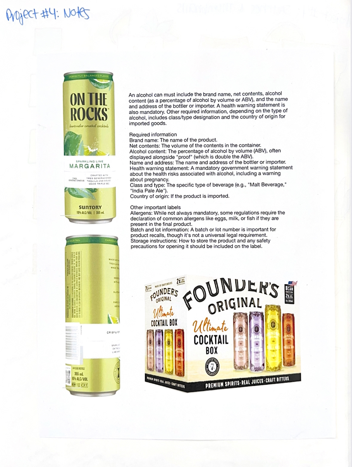
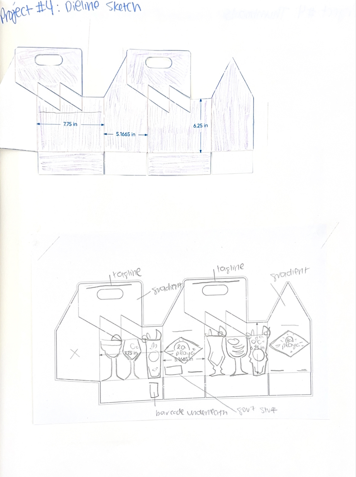
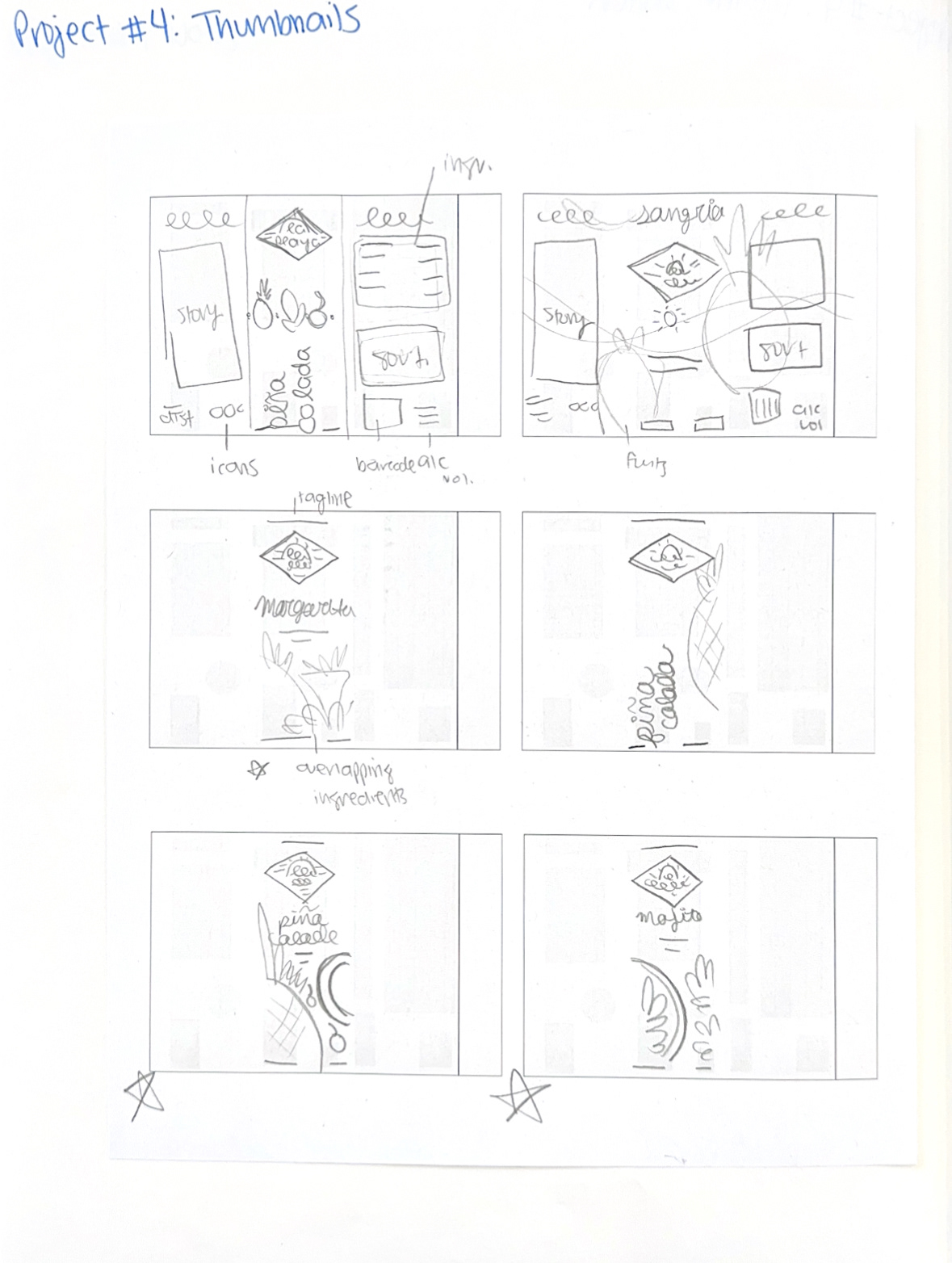
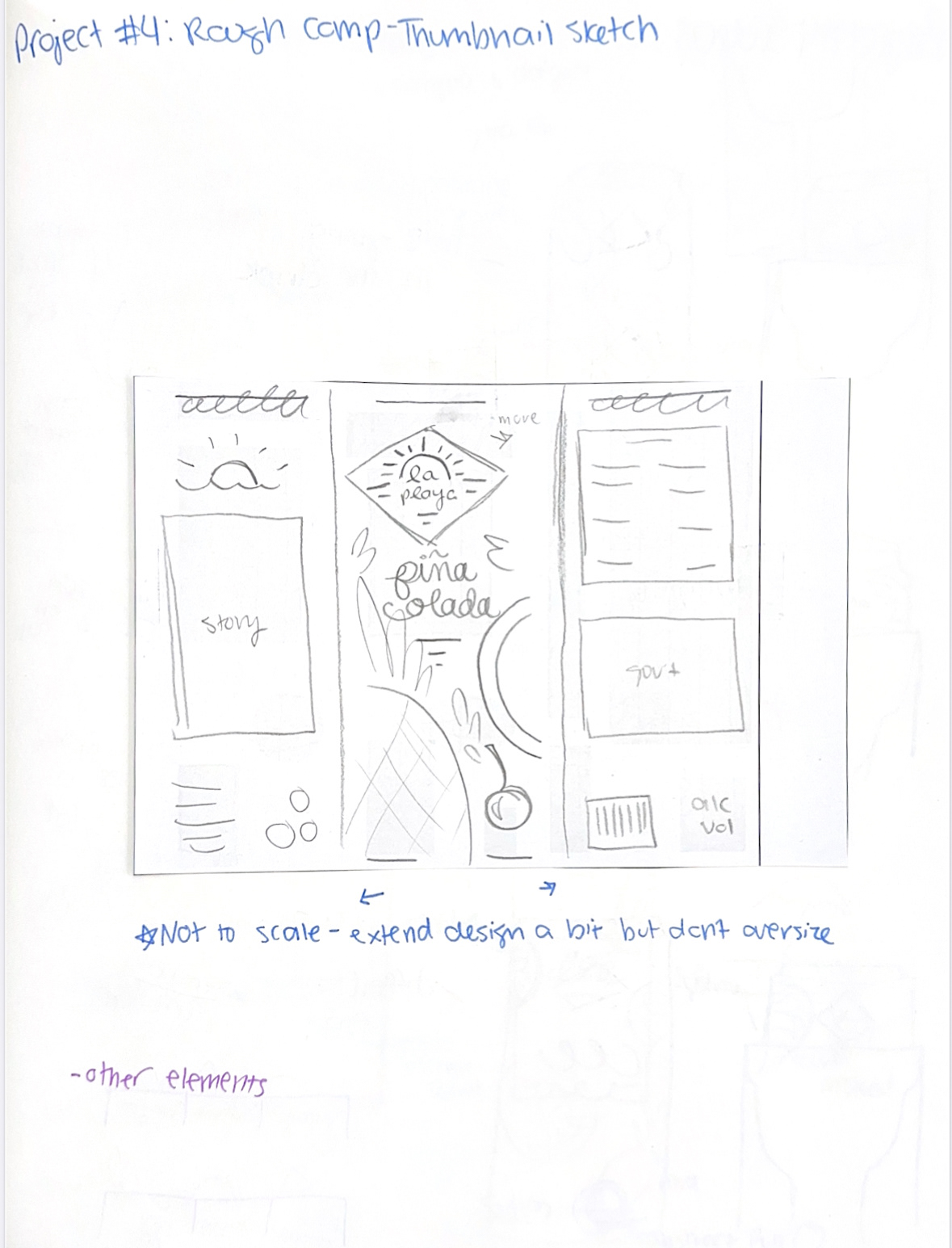
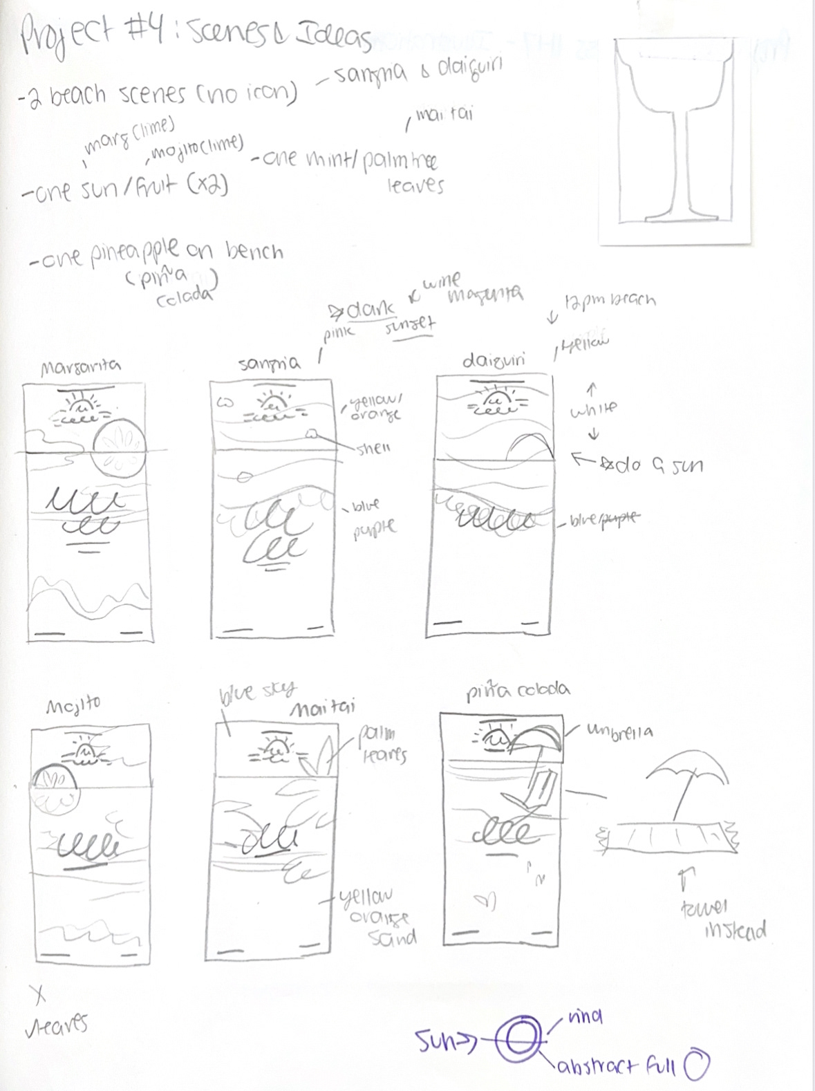
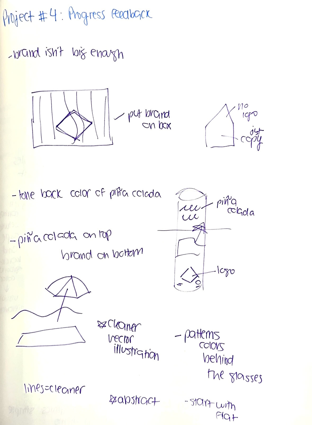
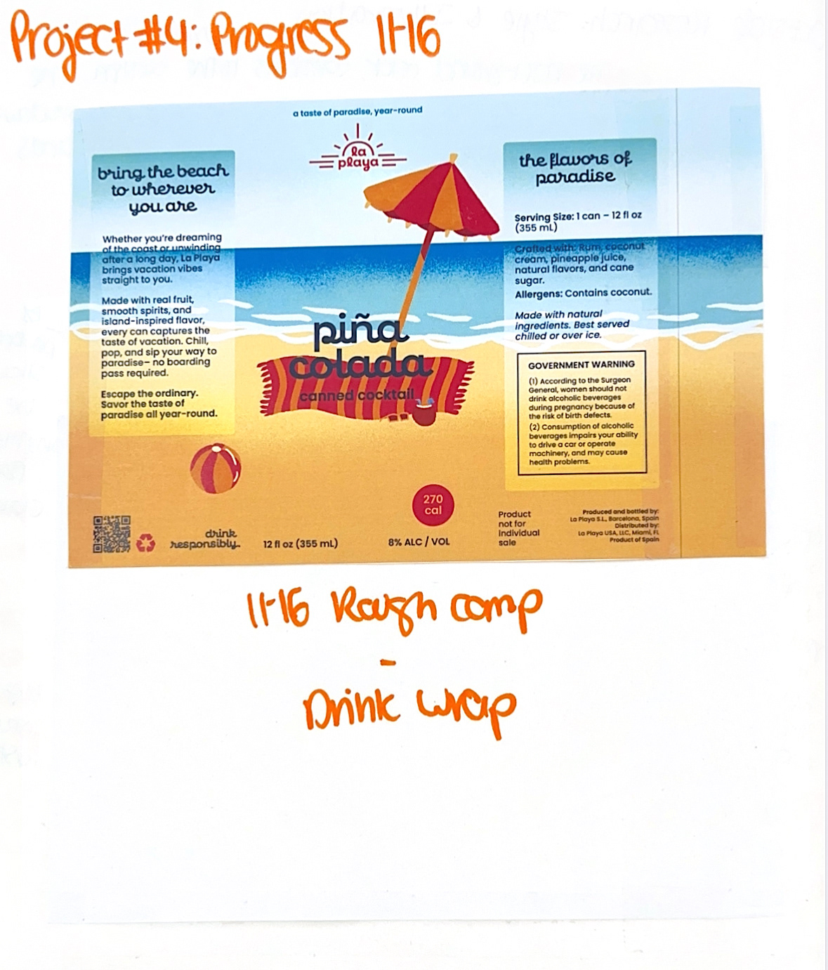
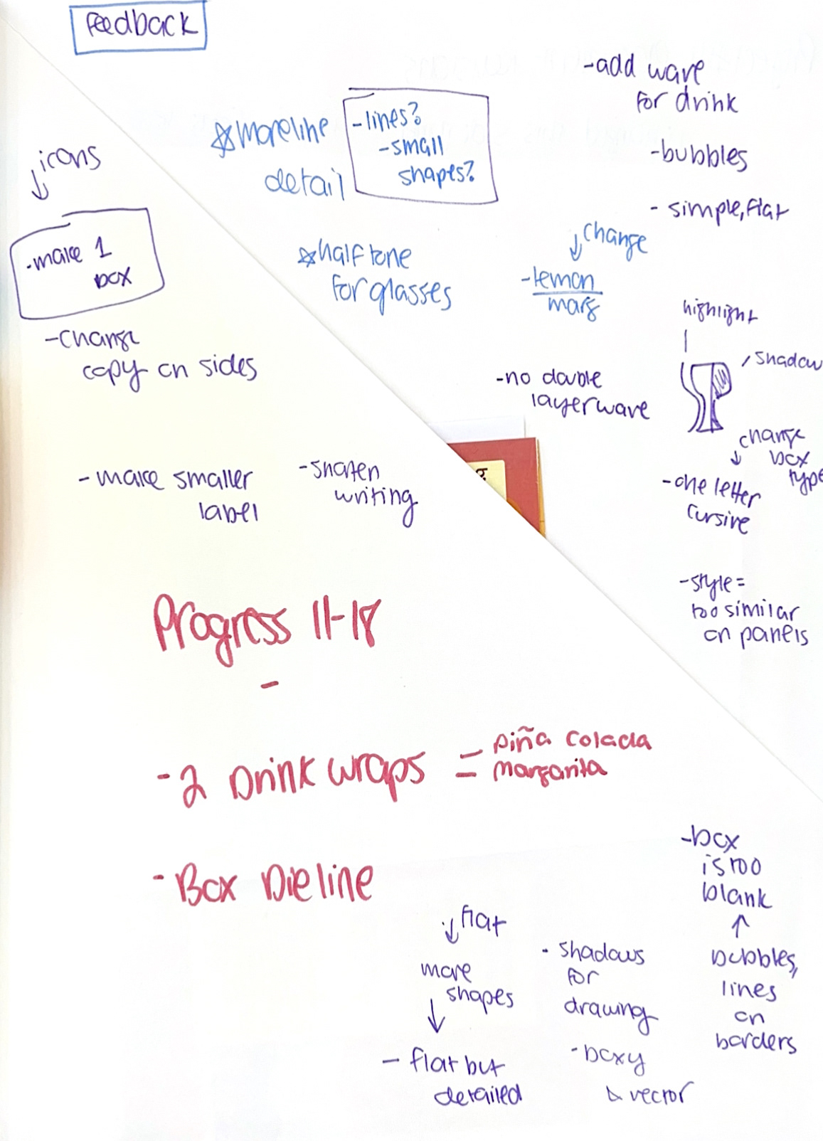
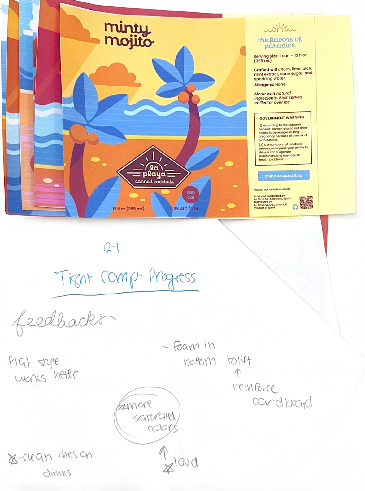
Below is a collection of my sketchbook work for this project. These pages include initial brainstorming, visual research, rough sketches, logo development, and early dieline prototypes. Together, they show how the brand’s personality, tone, and structural ideas began to take shape before moving into refined digital design.