For as long as I can remember, I’ve lived with my head in the clouds– always reading, writing, drawing, imagining. Creating has always been my sanctuary, and stories feel like home. I got the idea for my first major book series in 2018 and have been developing it ever since– writing, illustrating, and bringing its world to life piece by piece.
Over time, I found myself pulled between graphic design, writing, and art, until I realized I could bridge them all together. Not only do I want to share the story that has been an anchor for me throughout the past few years, but I want to offer that same opportunity to other authors and help create worlds that give people the wings to escape, even for a little while, into something brighter, more colorful, and more free. 
However, in the modern publishing world, many passionate authors struggle to find a home for their work, especially when large publishers often prioritize market trends over creative vision. I want to build a space where stories driven by imagination and authenticity can thrive without compromise. Thus, Wrenfeather Press was born– a culmination of all my creative passions and drive, giving readers and authors alike the chance to experience the wonder and comfort that a powerful story can bring. 
This project involved the marketing and branding of Wrenfeather Press, an independent publisher focused on crafting artisan books primarily within the fantasy genre. In order to demonstrate the operations of the press, a comprehensive campaign for my original book series, Eclipse, was created. This was accomplished through extensive research into the publishing industry and included in-depth comparisons of branding, advertising methods, and business models. Additionally, research was conducted on the history of publishing within the fantasy genre in order to understand the evolution of attitudes towards the fantasy genre as a whole as well as the general history of publishing and formats of literature. The final result included brand identity, advertising, product design, digital collateral, and printed materials.
The logo is a combination mark, combining an icon with a typeface. The icon is of a wren bird, which is a tiny bird known for their loud song. Similarly, Wrenfeather Press may be a smaller independent press, but will be made distinctive by their bold and memorable voice in their branding and marketing. Additionally, the accented lowercase letter f resembles a forte symbol, which is a musical dynamic meaning to play loudly. Furthermore, the “feather” portion of the name ties back to a quill, a writing instrument used often in fantasy literature, as a subtle nod back to the genre Wrenfeather primarily publishes within.
In addition to the primary logo, a set of alternative logos was designed in order to fit a variety of dimensions and needs. The isolated icon will be used for the spines of the books, creating a memorable impression at first glance. The stacked icon is best suited for collateral items in which the icon should be featured with greater detail, and the decorative monogram is reserved for occasional uses on high-end collateral. The wide format logo is used for narrow spaces in which there is not much space for the detail of the logo to remain visible.

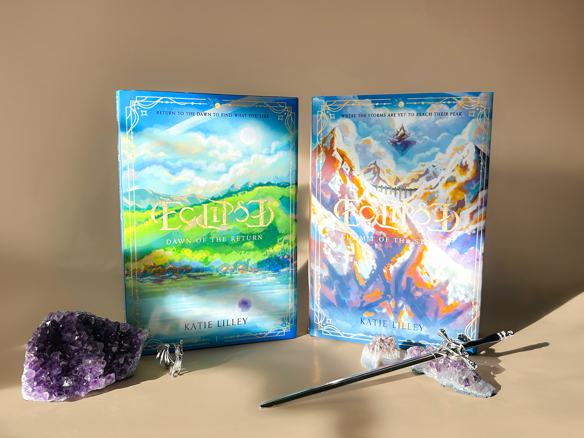
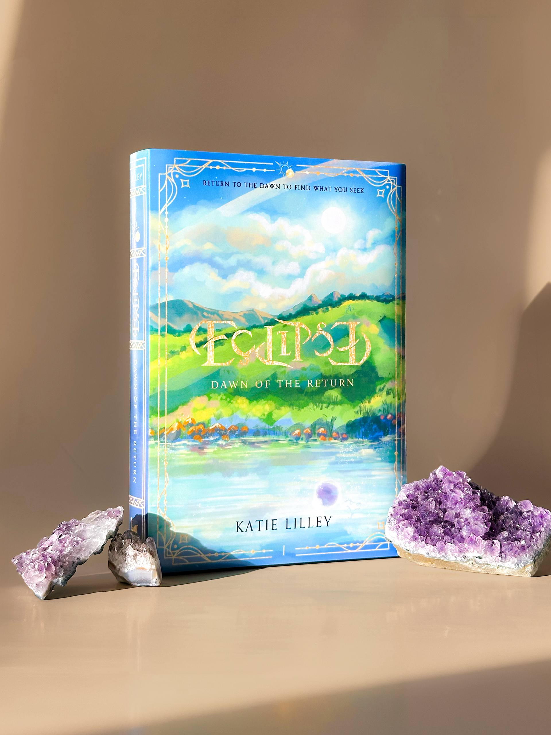
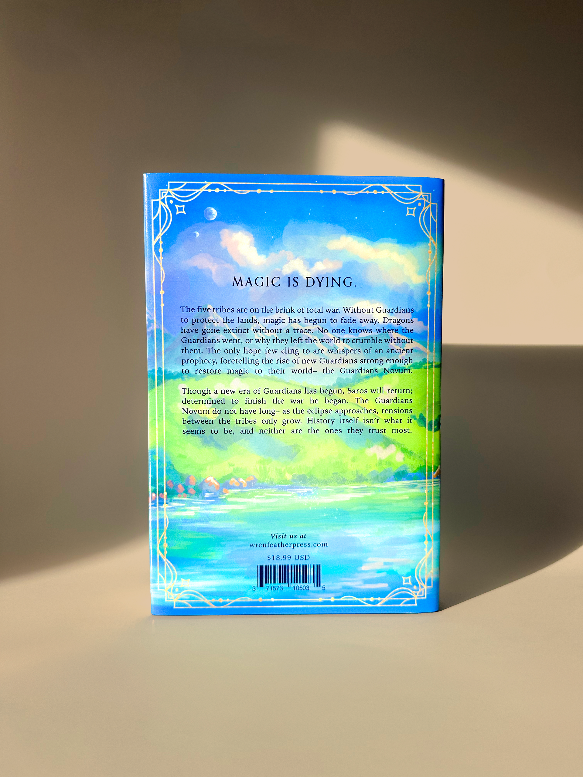
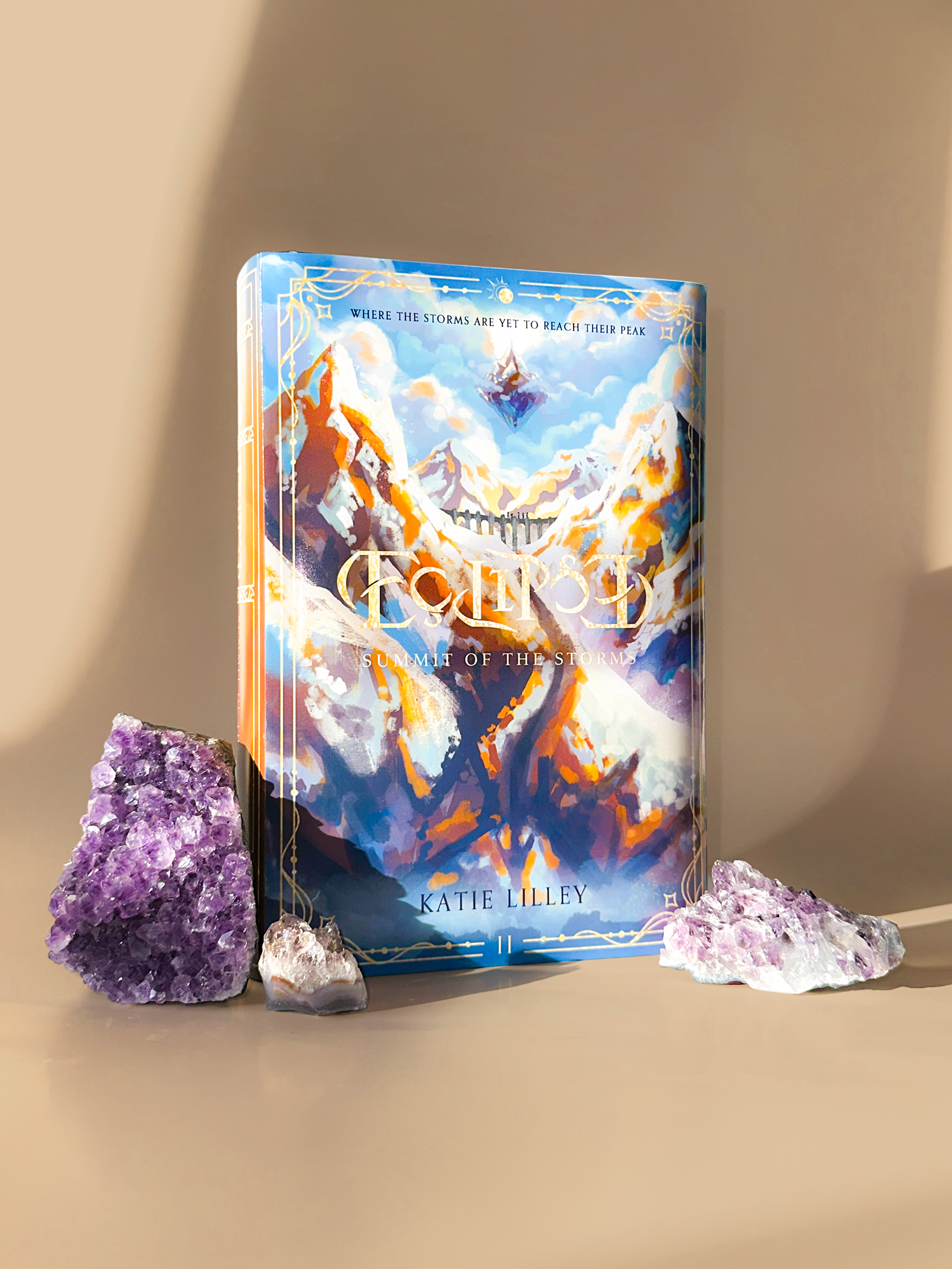
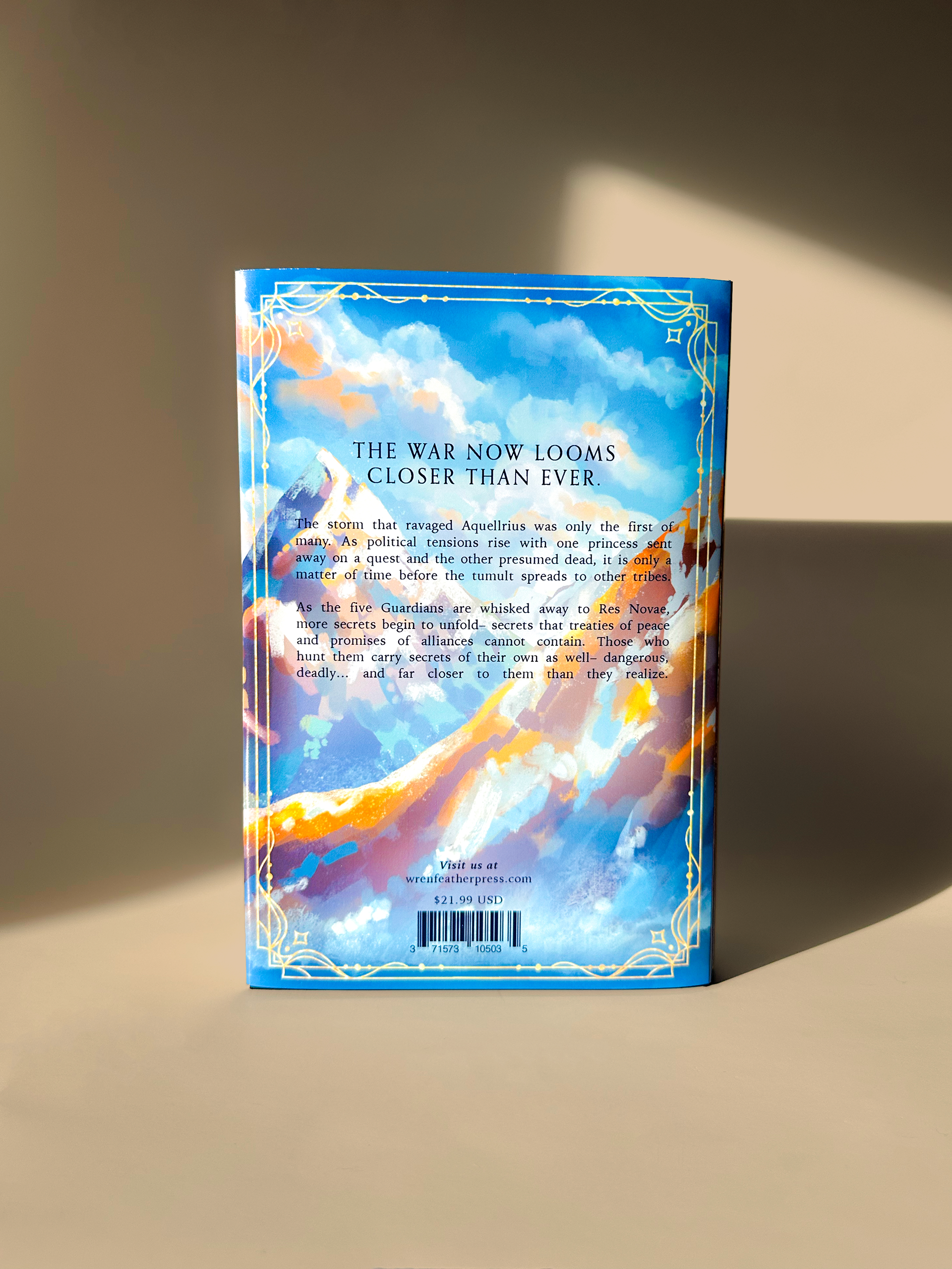
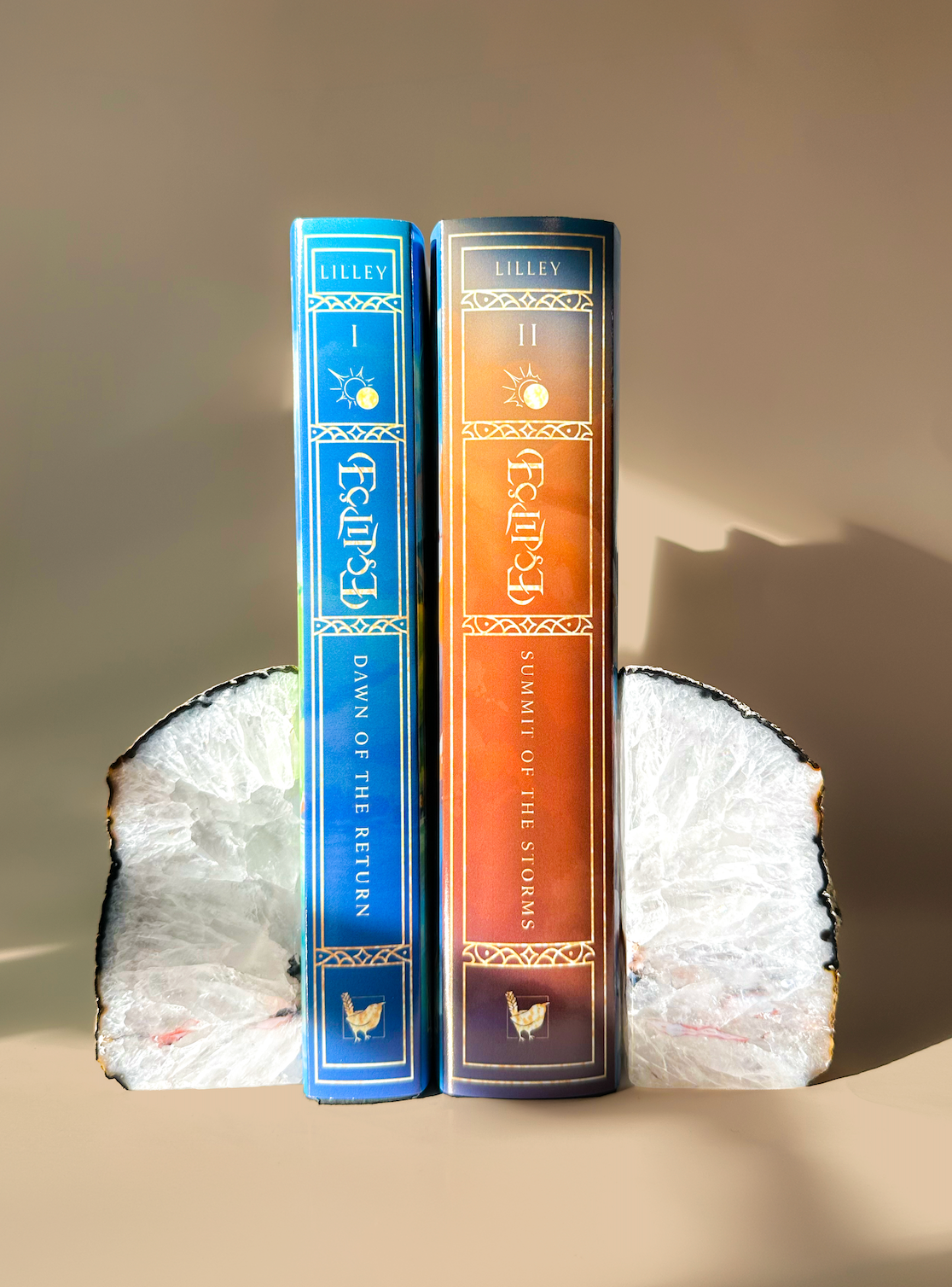
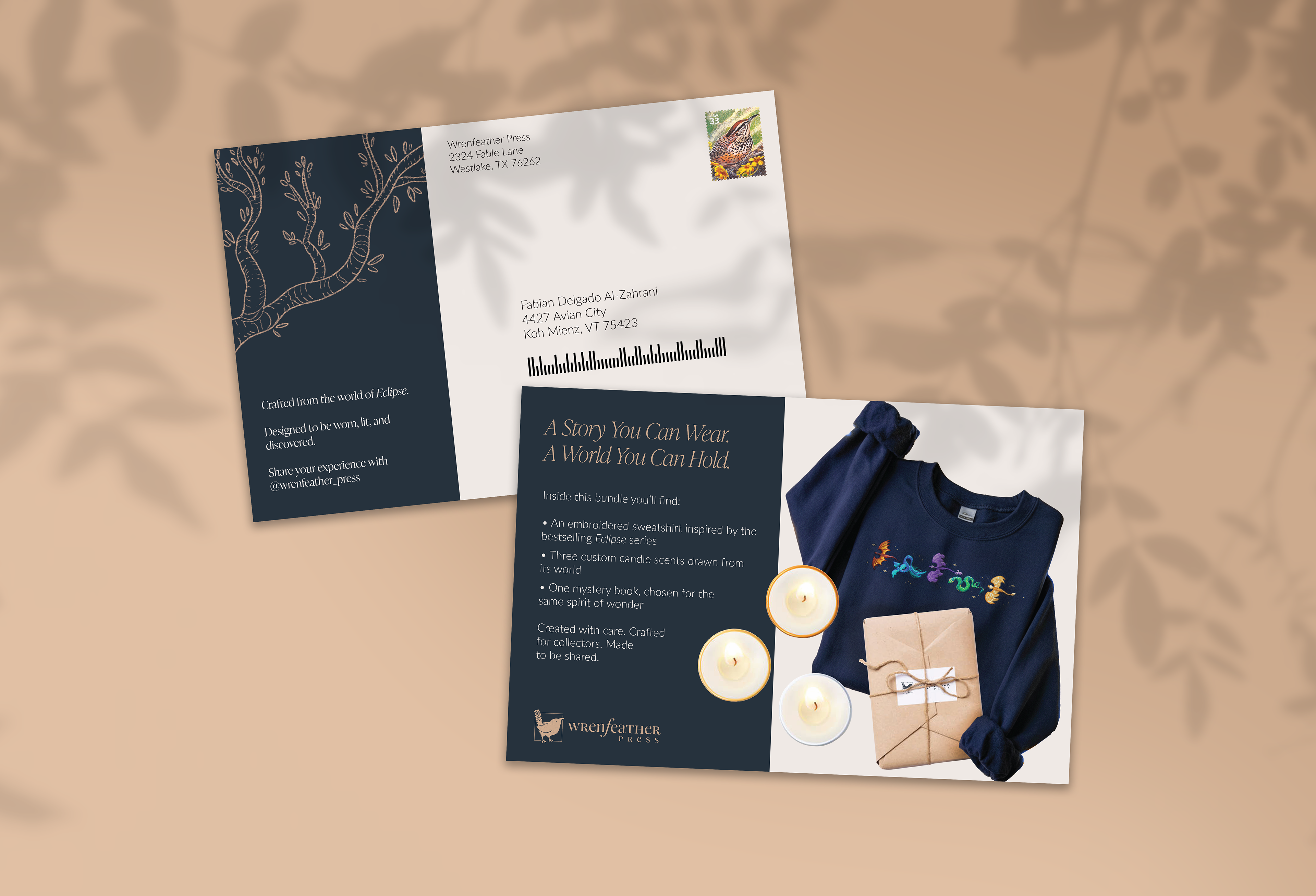
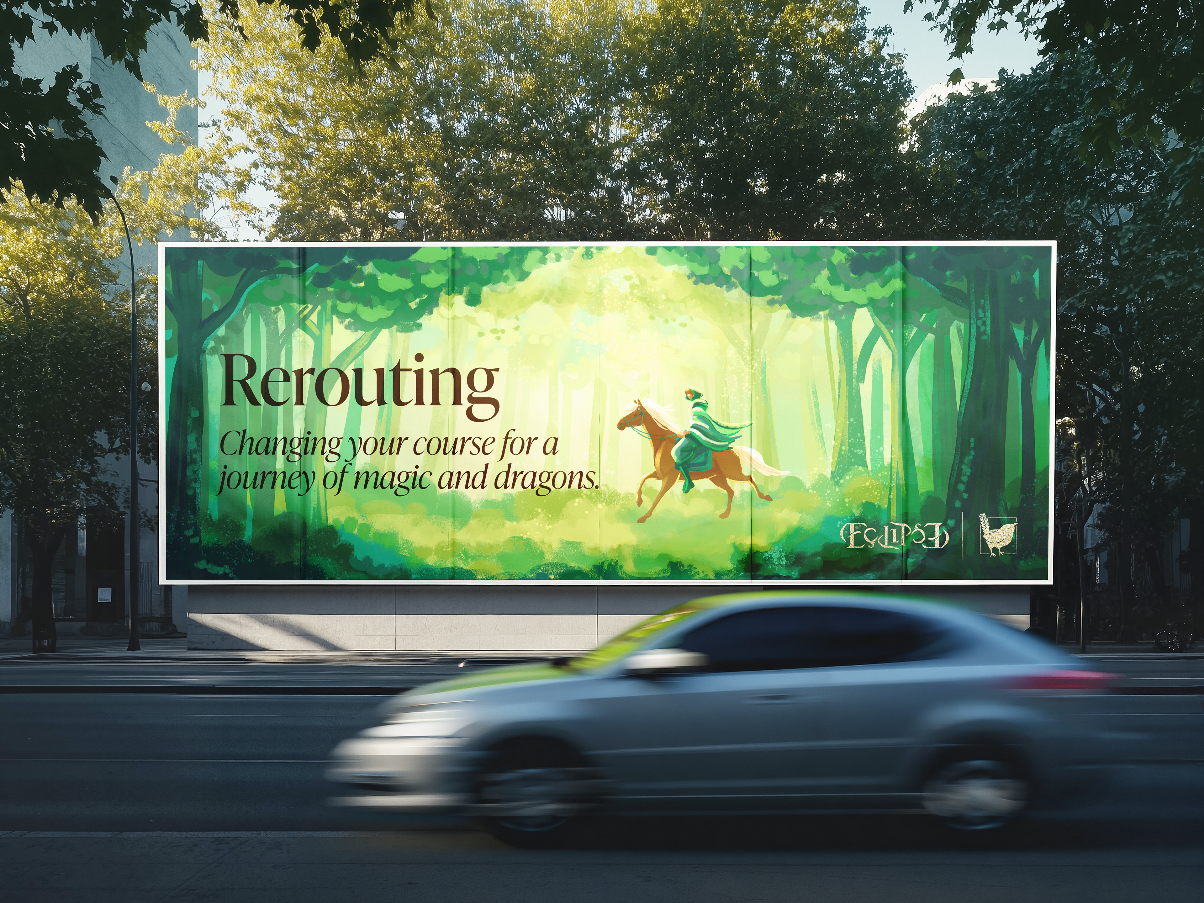
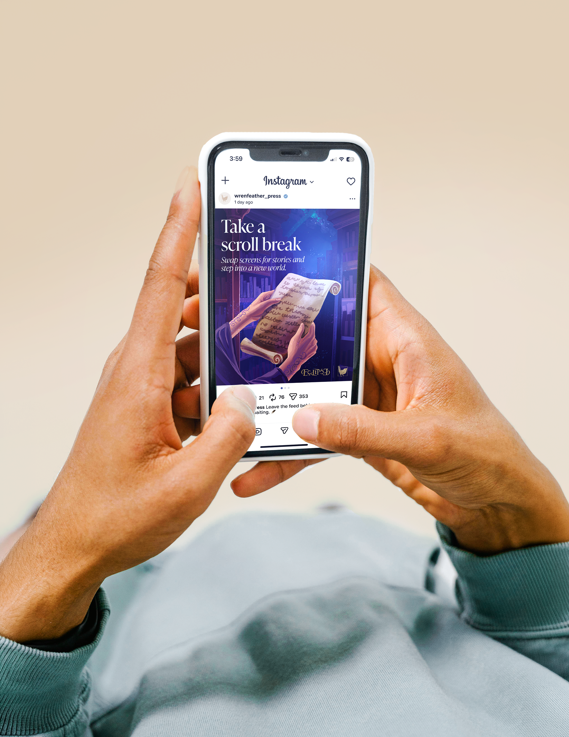
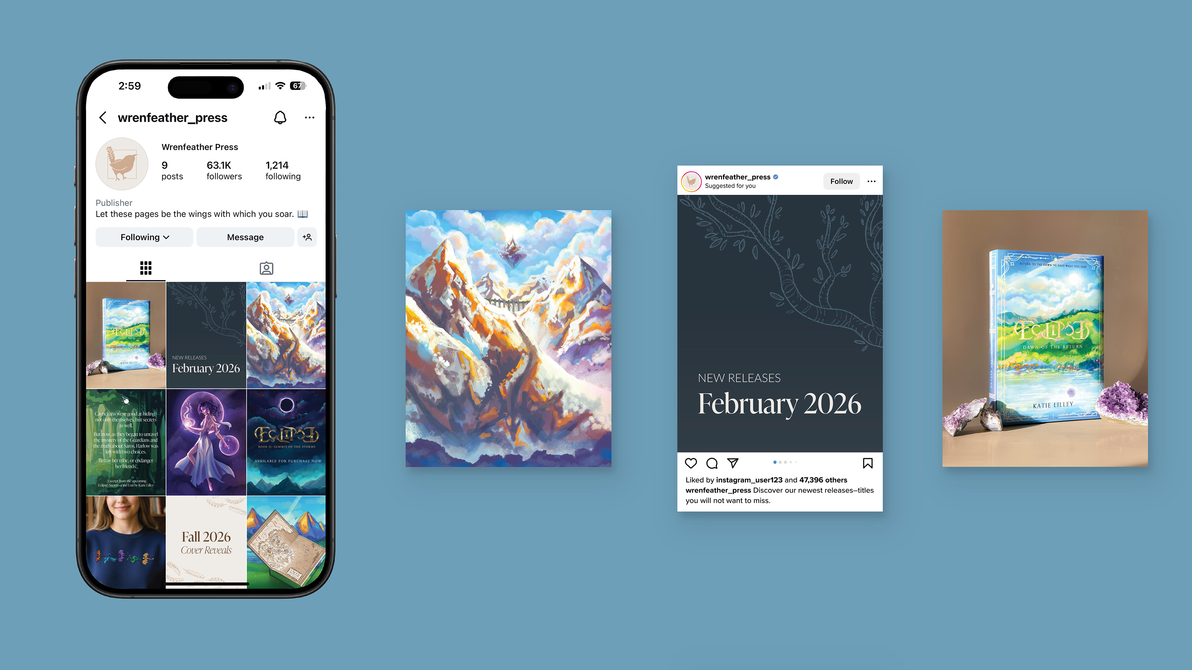
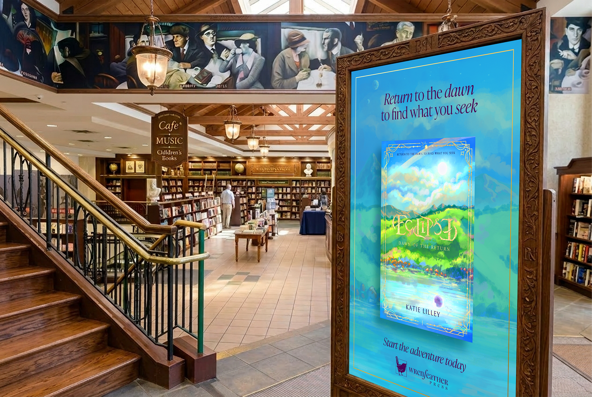
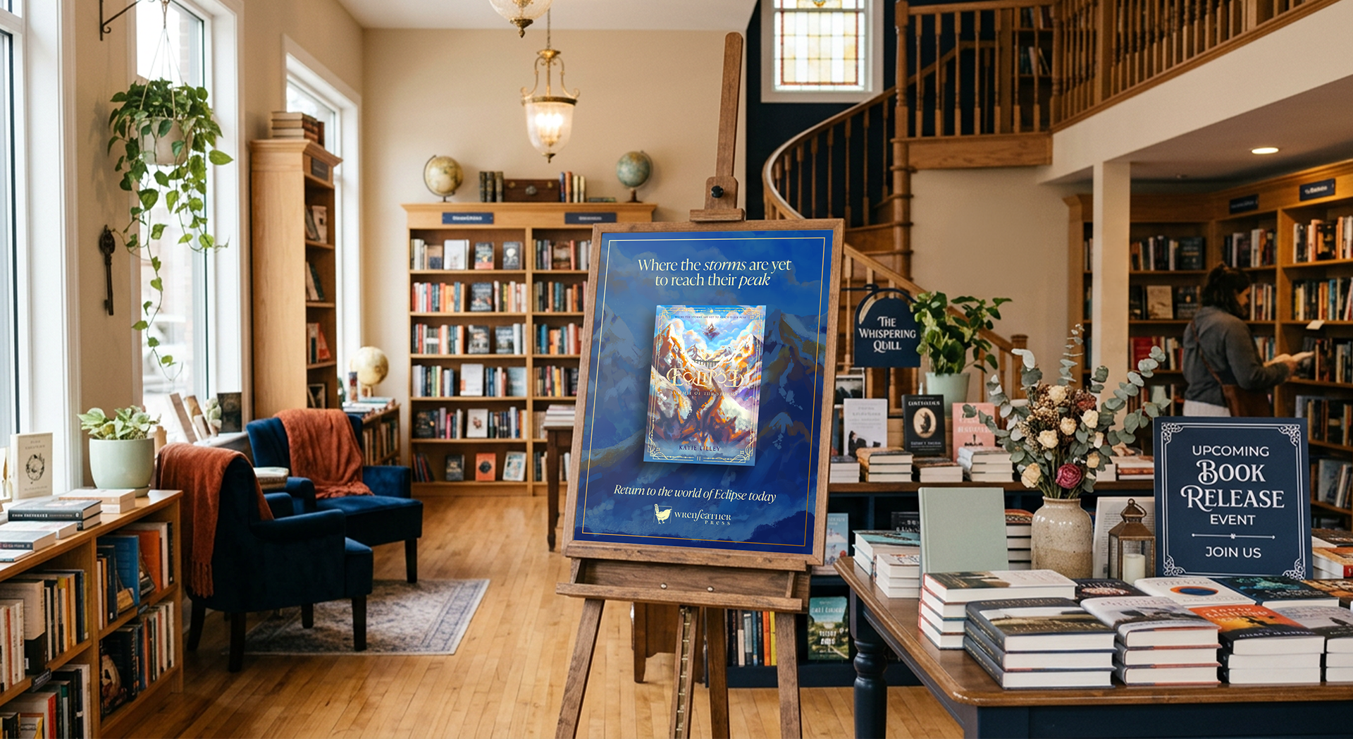
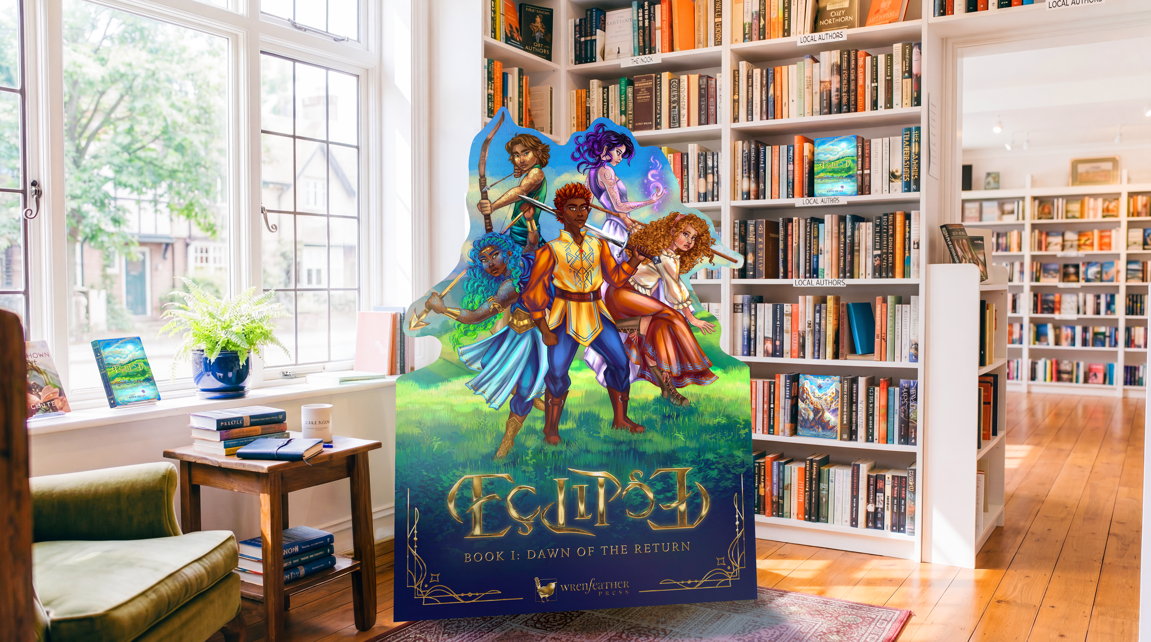
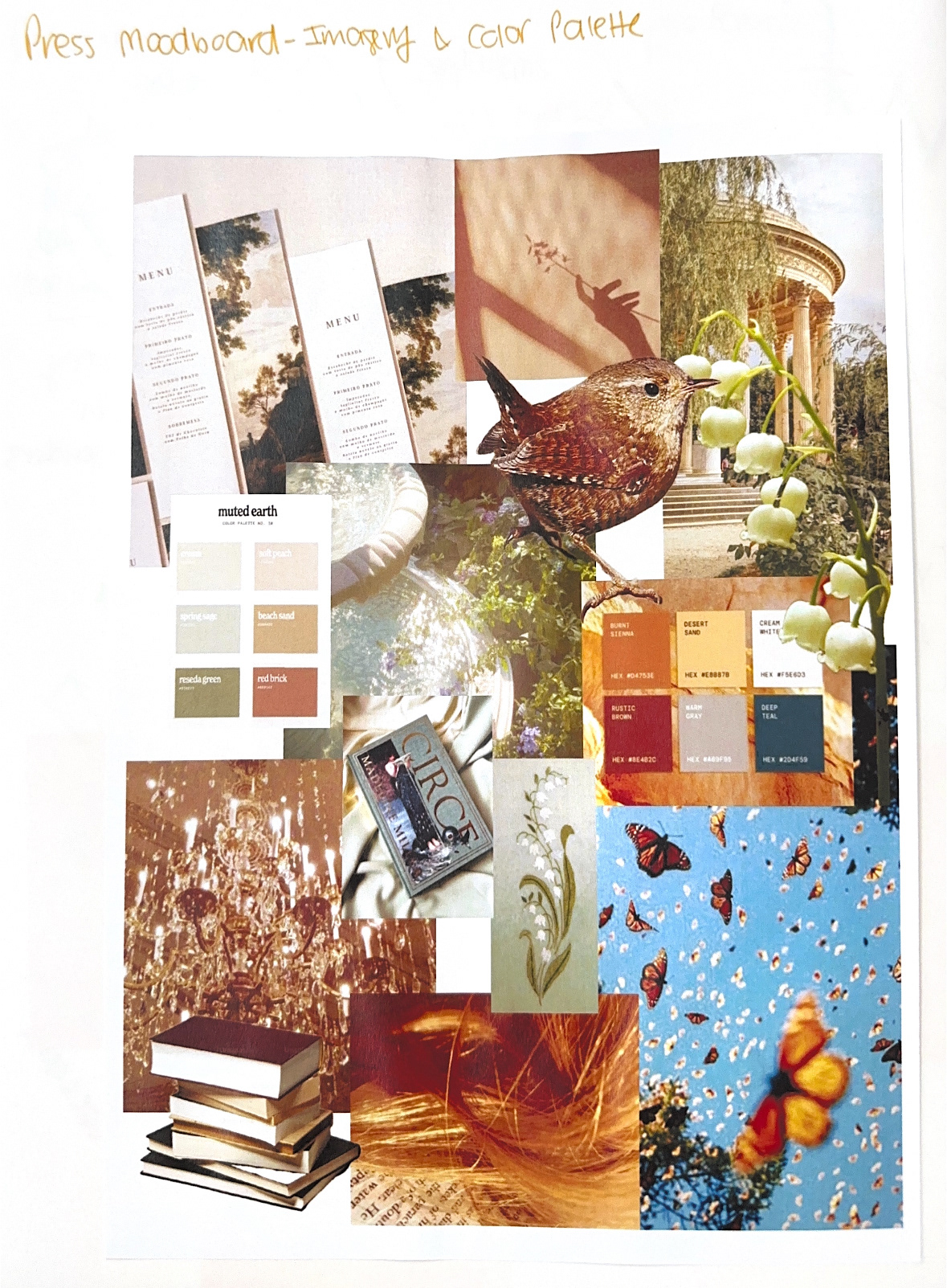
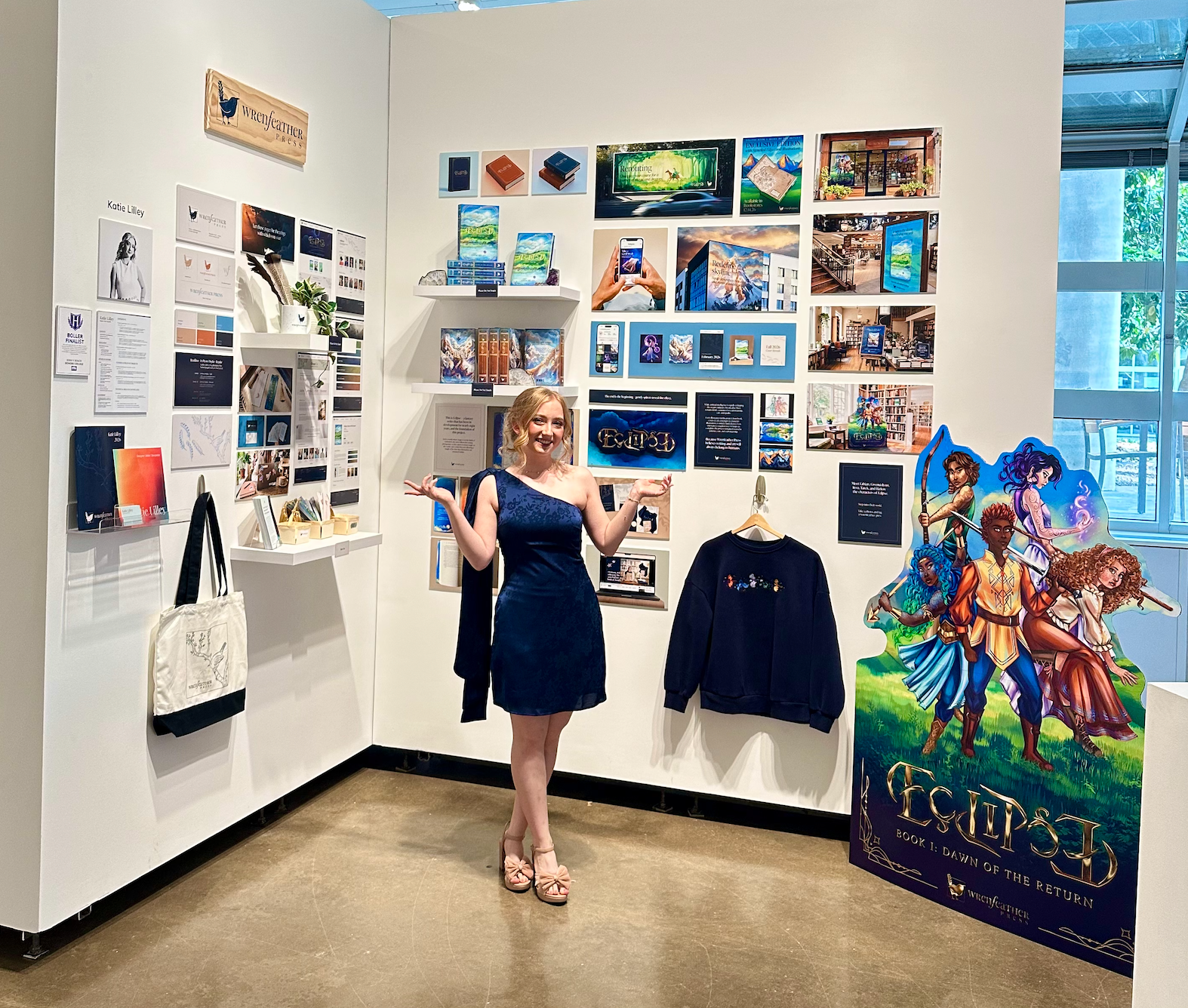
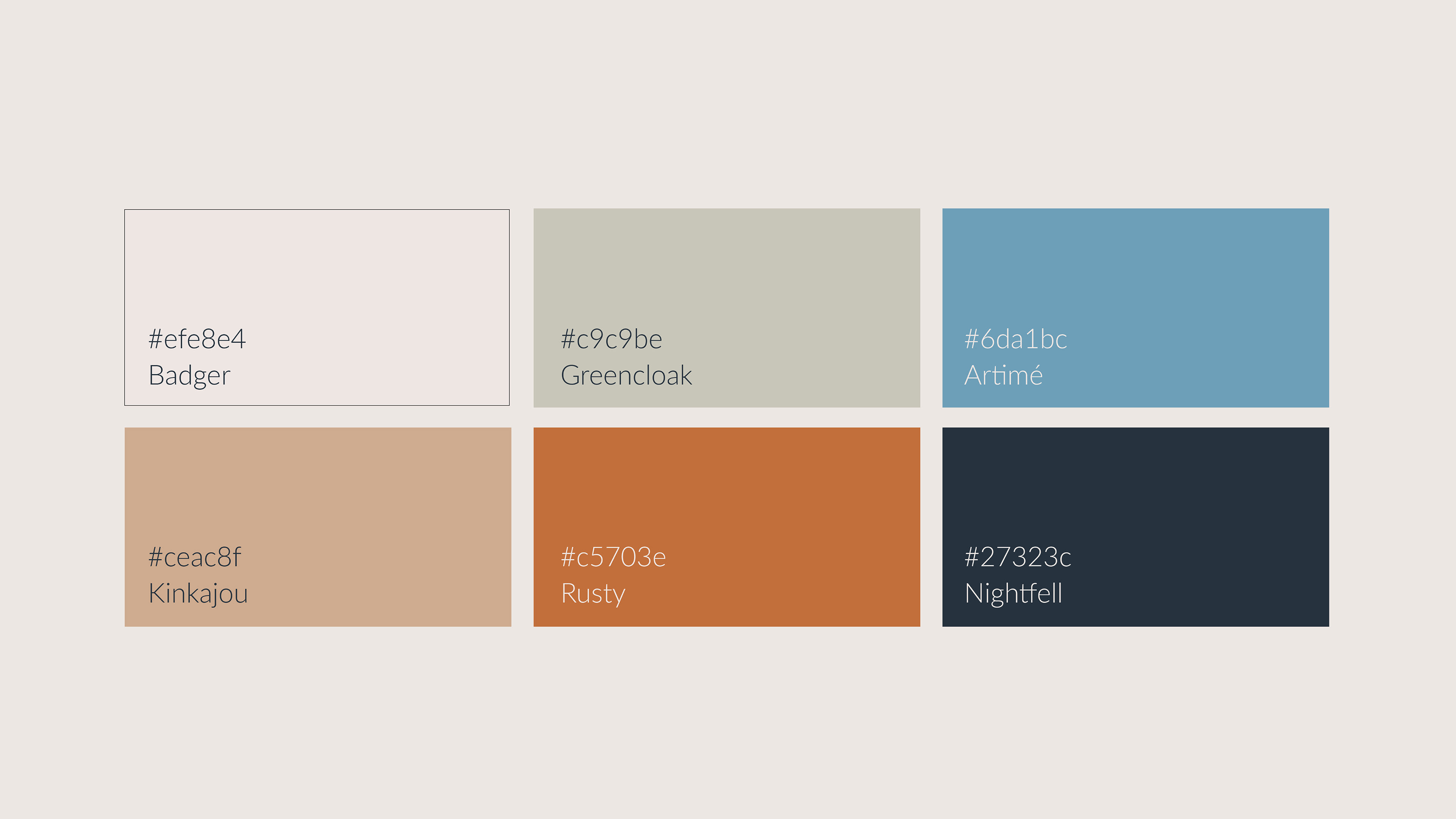
The color palette is kept largely neutral in order to allow for the highly detailed and often brightly colored fantasy book designs to remain stronger in the visual hierarchy of advertisements, and within collateral such as catalogs and websites. Brighter colors such as Artimé (#6da1bc) and Rusty (#c5703e) are incorporated into the color palette in order to brighten the visual identity of the brand in spaces in which book covers are not a part of the design. 

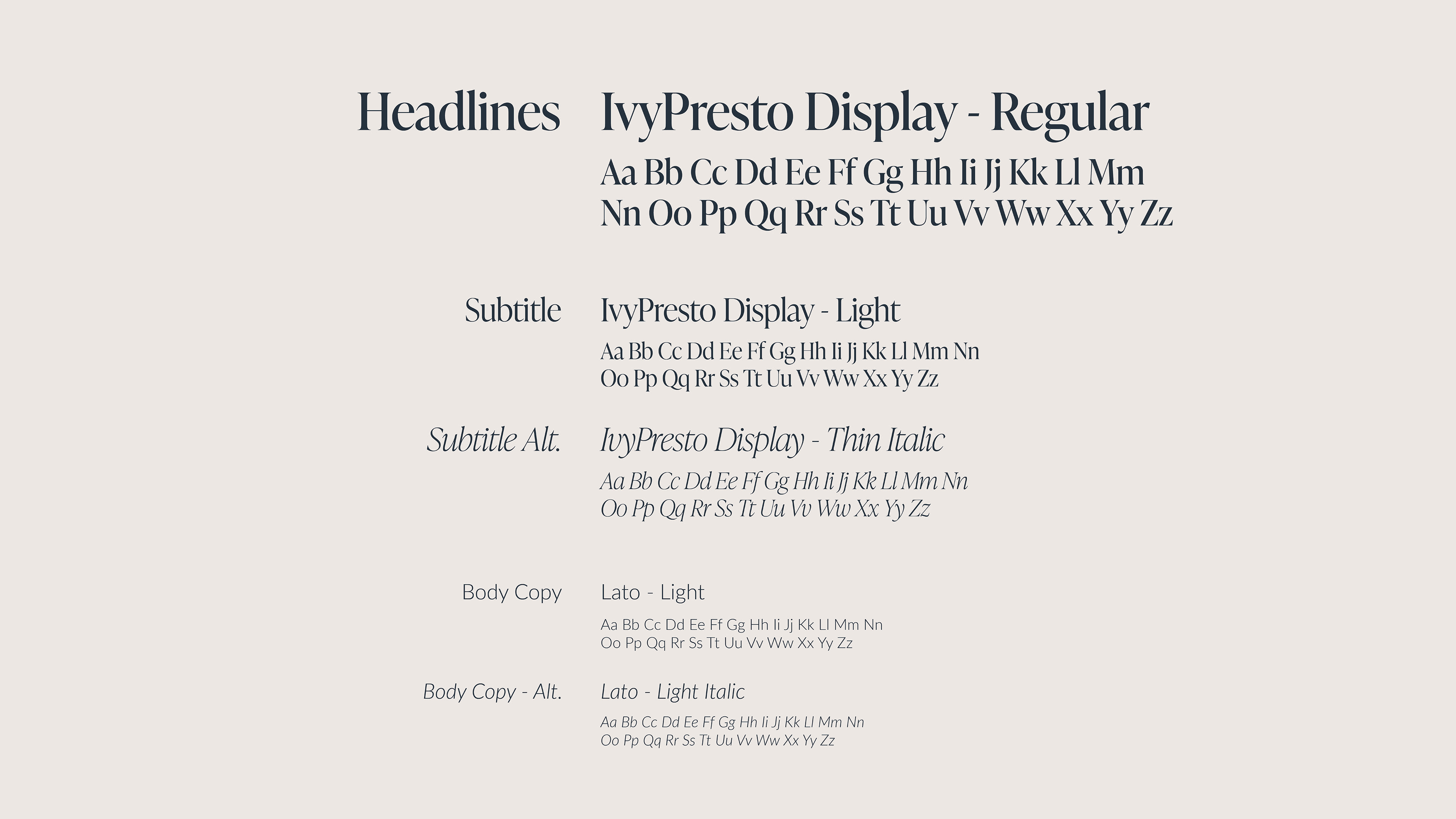
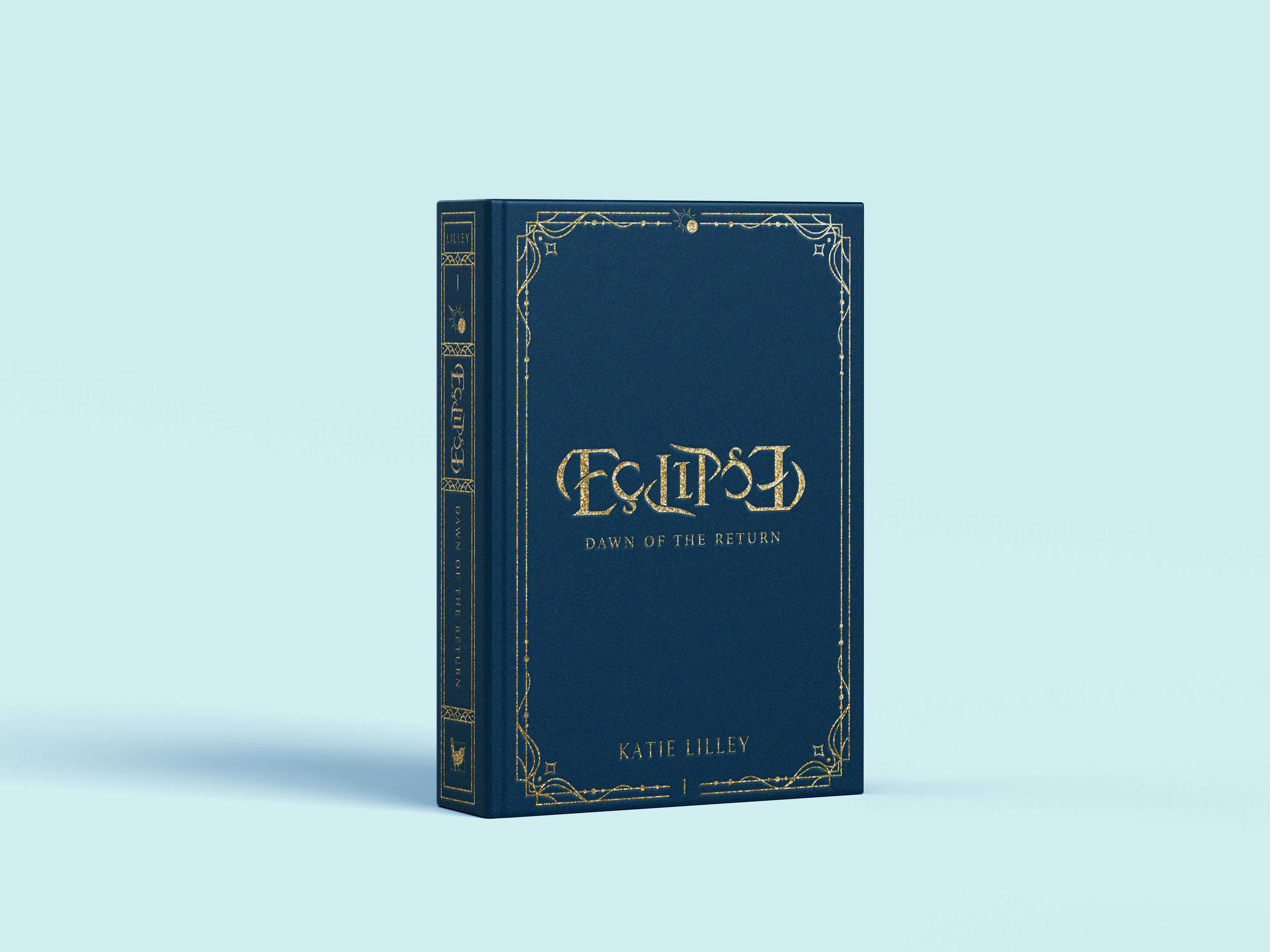
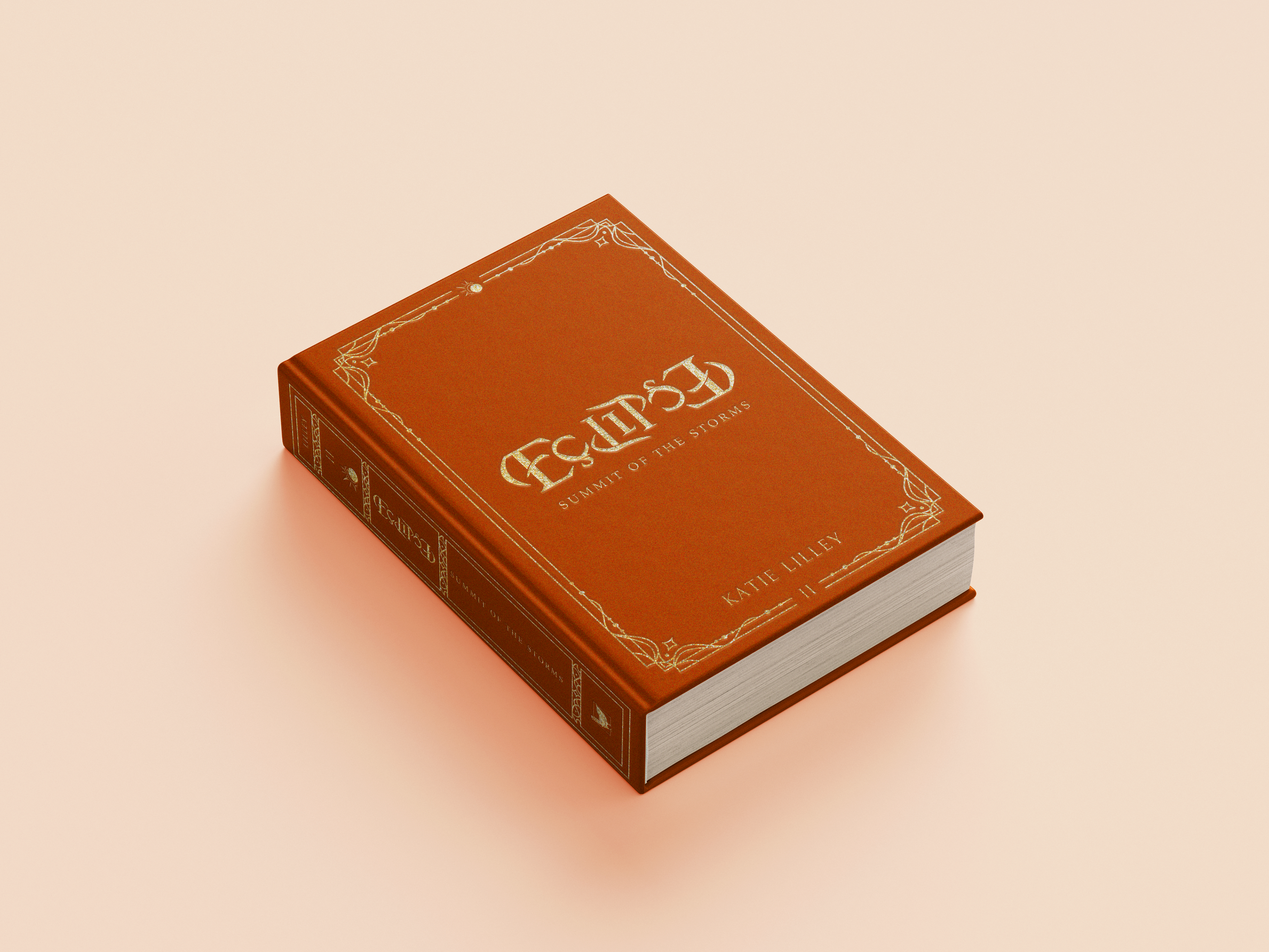
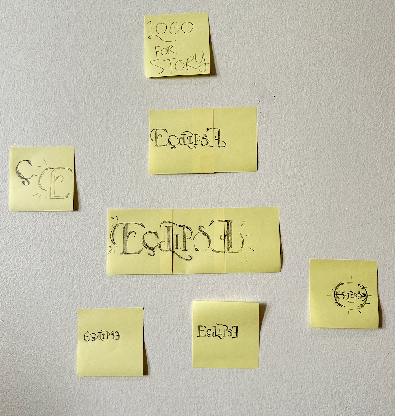
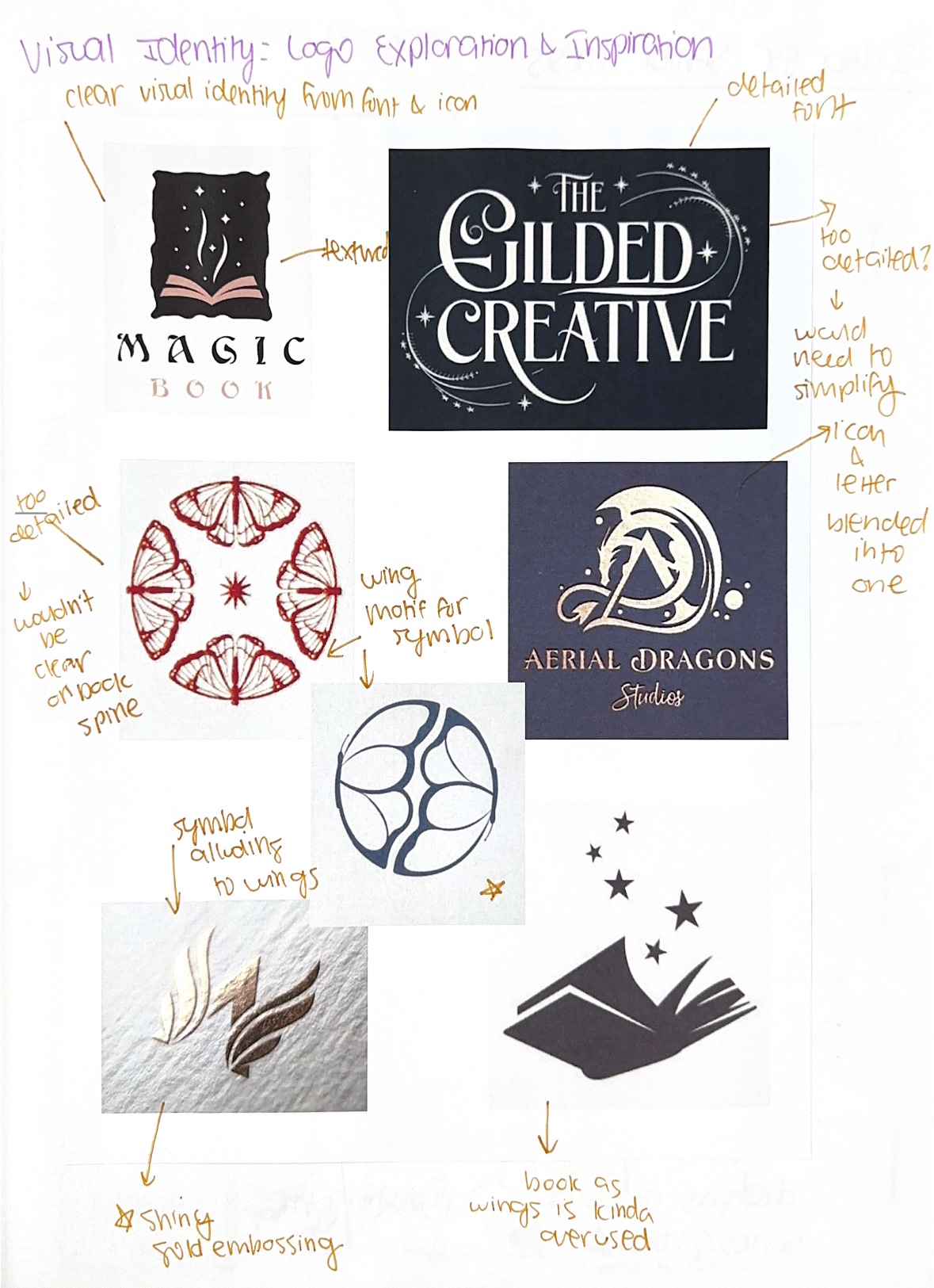
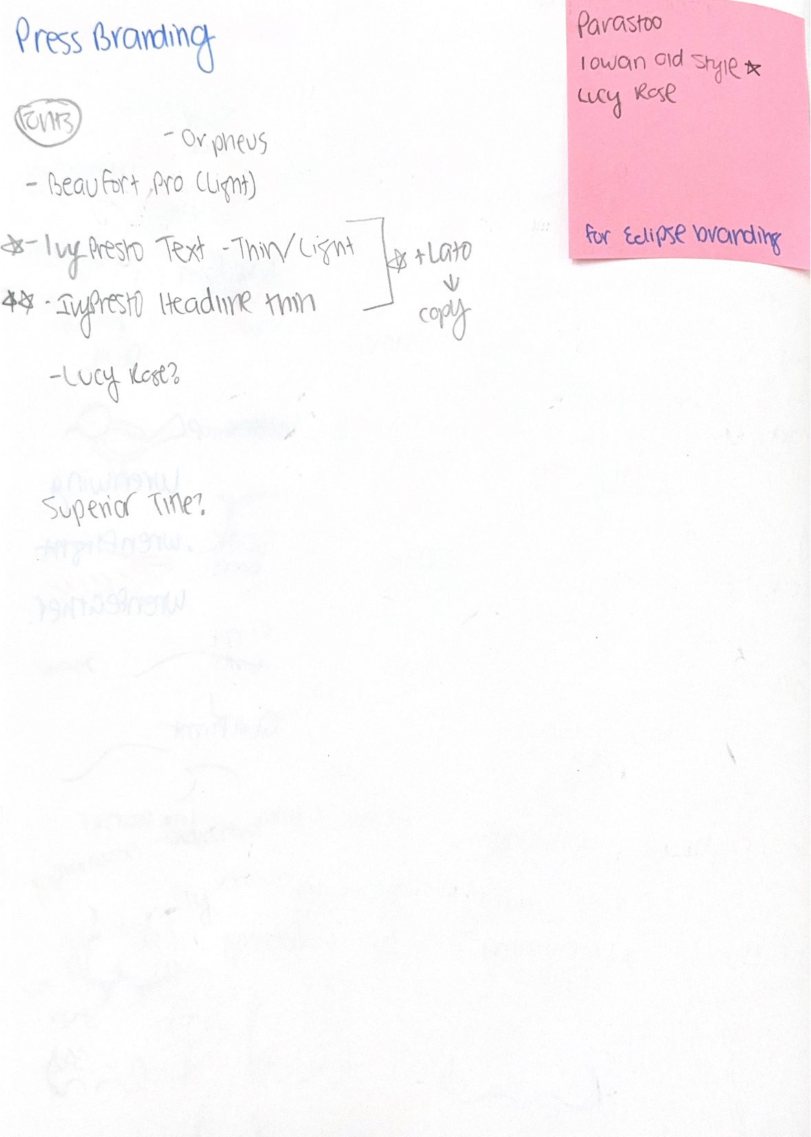
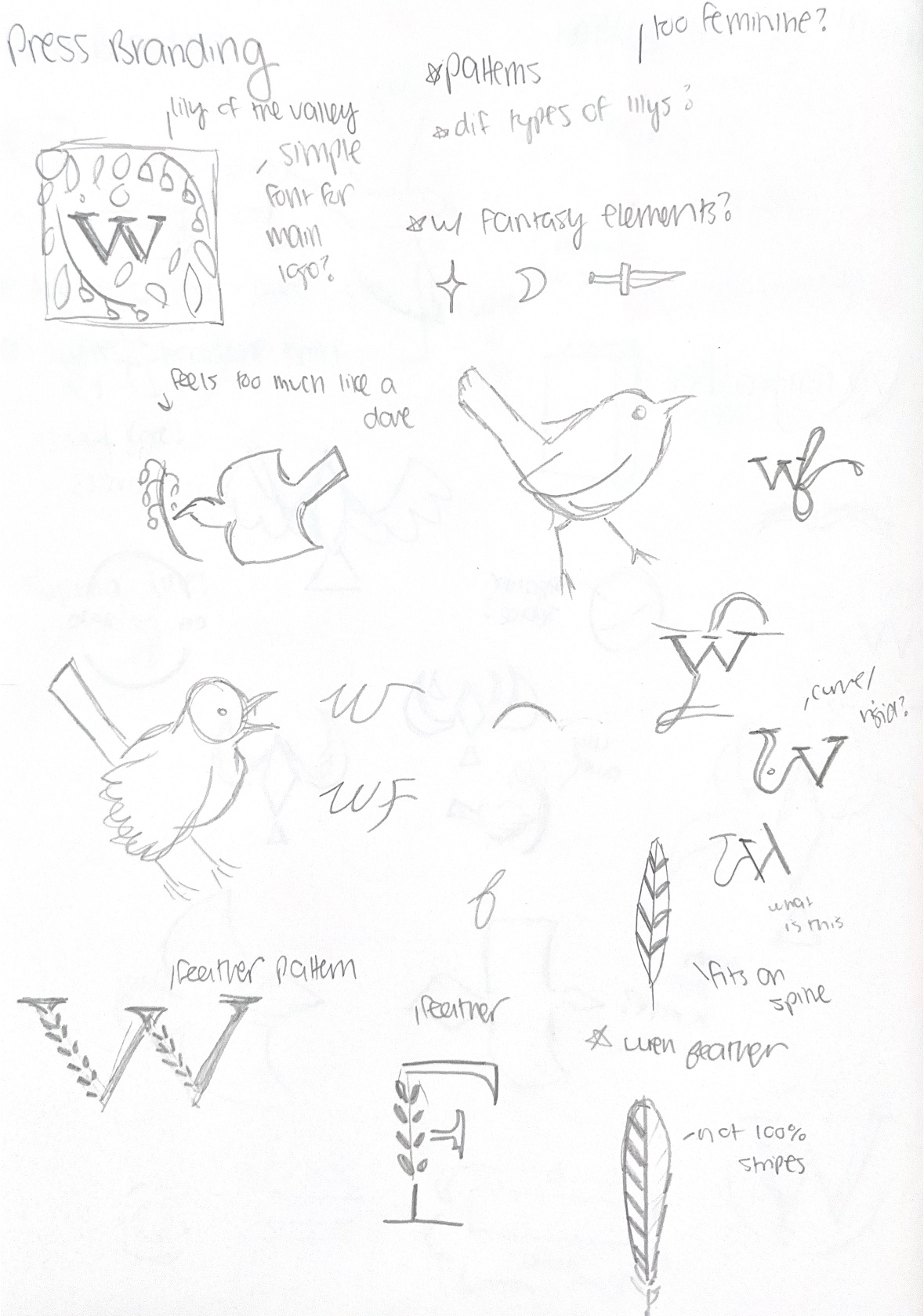
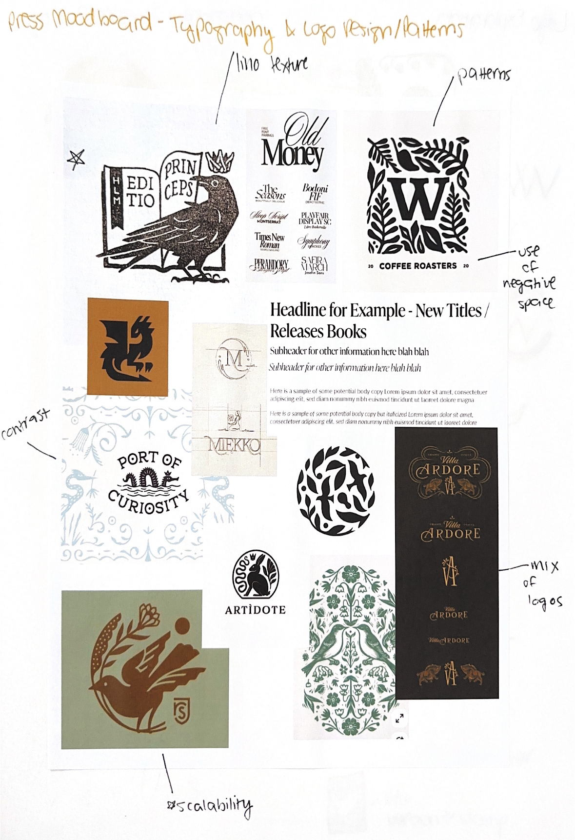
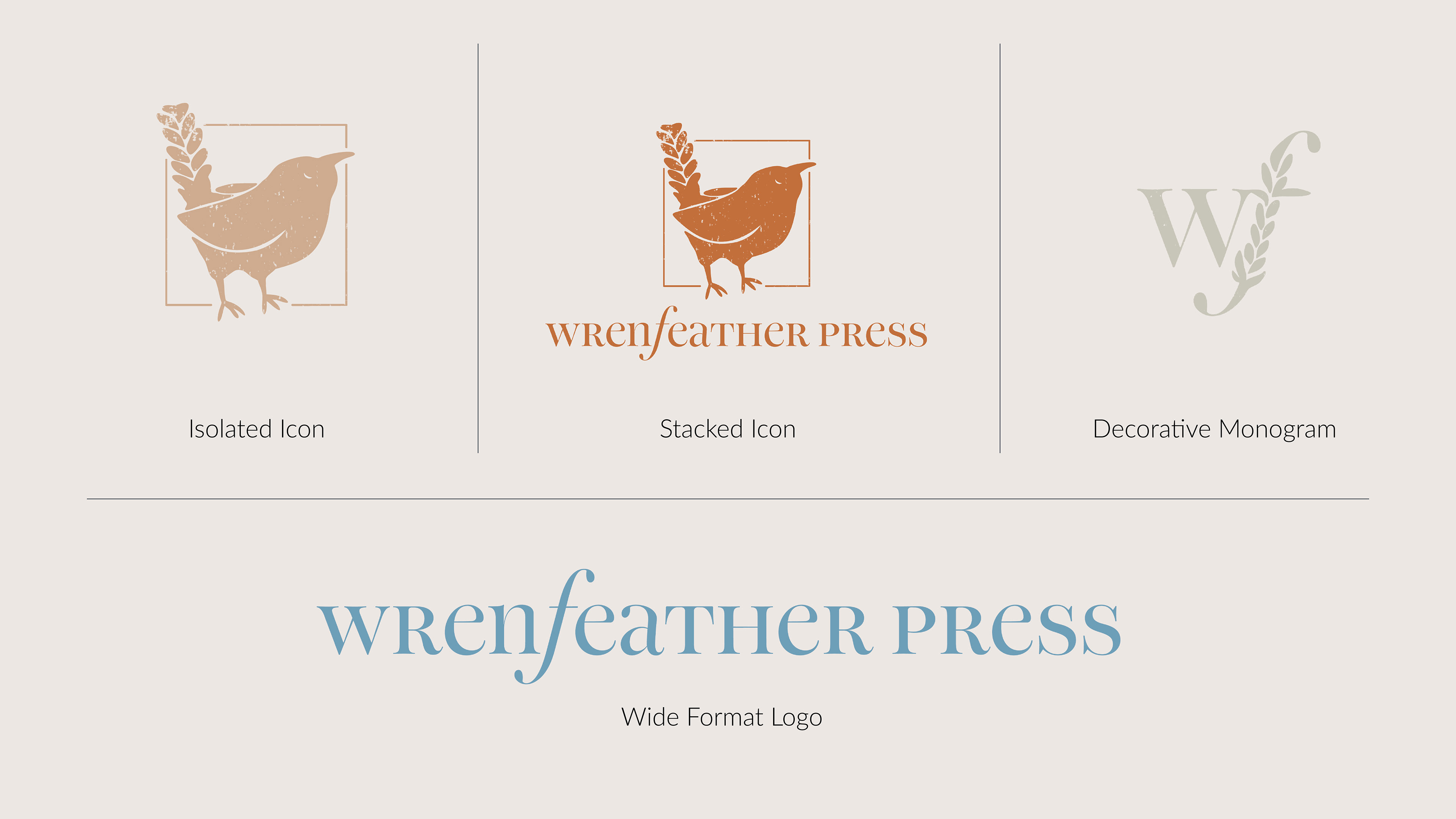
In order to balance between tradition and modernity, the slight serif typeface IvyPresto (Display) was chosen for the headlines and subtitles, while the sans serif typeface Lato (Light) was selected for the body copy. This balances the brand between the traditional, highly ornate fantasy style much of its products are rooted in, while remaining modern and competitive with other current publishers in the inclusion of a legible and clean sans serif typeface. 

A set of custom, hand-drawn icons was developed for use across various brand touchpoints. Incorporating illustration in this way reinforces Wrenfeather’s identity as an artisan press, rooted in craftsmanship and attention to detail. Even beyond the books themselves, this level of care is carried through every aspect of the brand, ensuring that its values of high-quality craftsmanship are visible at first glance.
The tagline of the press, “Let these pages be the wings with which you soar”, represents the mission of the brand– to craft books that serve as the “wings” in which the readers use to “soar” to new places. This tagline embodies the fantasy literature that Wrenfeather Press publishes– magical stories that allow their readers to escape elsewhere for a while. 
The illustrations are applied across various brand collateral such as mugs and tote bags in order to maintain a brand identity of high-quality craftsmanship even upon products that are not books. These book-adjacent products appeal to readers and writers– such as a mug for enjoying tea and coffee, and a tote bag to carry books or a writing laptop.
Business cards were designed for authors in collaboration with the press. Decorative elements are kept minimal to maintain a clear visual hierarchy, prioritizing the person’s name, title, and contact information.

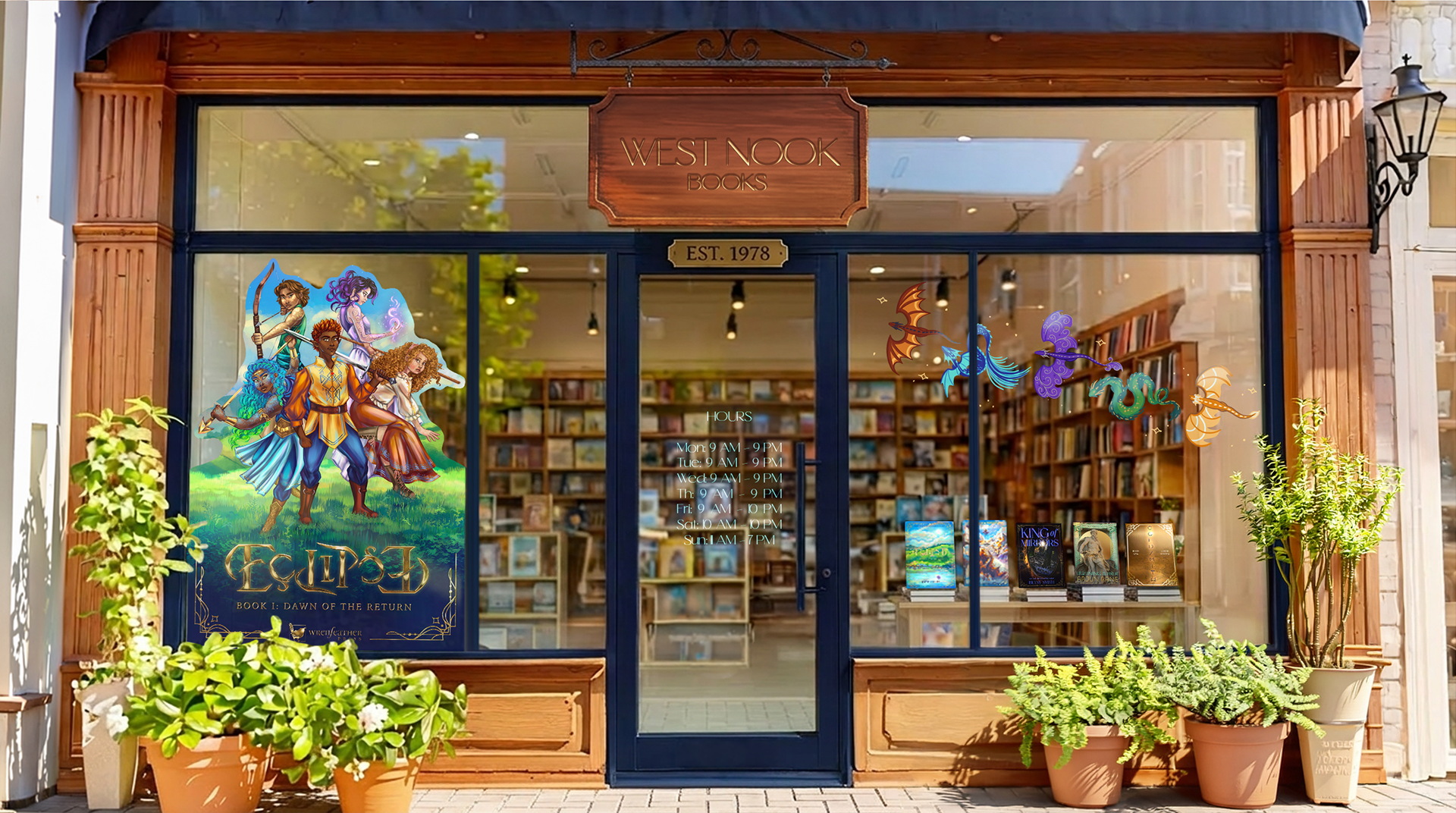
A comprehensive website was designed in order to serve as a landing page for new and returning users, functioning as both a marketing platform as well as a point of sale from which users can purchase books. 

The homepage features a motion-animated teaser for the current new release book, as well as links below to take the user directly to the page of the book so they may be able to purchase it. A designated field to sign up for a newsletter is listed below, as well as articles covering various topics, such as lists of bestselling books or other book-related topics. Additionally, there is an explore option below which allows users to navigate between new releases, bestsellers, or coming soon titles.
The about page functions to explain to the user the mission and values of the press, as well as to detail the history behind its founding. The color palette is kept neutral in order to maintain a cohesive brand identity, but the inclusion of the brighter blue color Artimé (#6da1bc) ensures the overall visual aesthetic is not too dull. Sketchbook illustrations were pulled for the “Our Story” section in order to allow the brand to feel real, and establish authenticity. Strong contrast between subheadings and body copy was maintained in order to ensure the visual hierarchy remained clear and highly legible. 
The authors page allows users to view which authors are best sellers, as well as view other authors who have multiple books published with Wrenfeather Press. Beneath the author name, a few of the author’s most prominent titles are listed, allowing for easy navigation as well as to generate interest and direct users to explore these books. This function is seen often on publishers’ websites, in order to direct users to the author’s individual page and discover more books that are similar to ones they previously purchased and enjoyed. 
The collections page features a unique categorization system, complete with custom illustrations for each section. While Wrenfeather Press publishes primarily within the fantasy genre, there are a wide range of sub-genres within fantasy that the collections page breaks down into unique categorizations, such as “Daringly Draconic” for books with dragons, or “Worlds Within” for urban fantasy. With this categorization system, users are able to explore additional books that are categorized with their favorites. 
The book information page functions as an e-commerce page that allows users to purchase books directly from the website. The information listed under the book provides users with useful information regarding other books in the series. Each book is tagged with a collection, allowing users to explore other similar books they may enjoy. Other important information each book page has is the summary found on the back of each book, an author biography, product features and details, and reviews from other users.
Book design is a defining element of any publishing house, as the titles it produces establish readers’ initial perceptions of the press and signal the quality and nature of its publications. Eclipse is a young adult fantasy book series that has been in the works for almost eight years. Set in a world where magic is on the brink of extinction, the story follows five young protagonists as they quest to return magic to the world, only to find they are following a tangle of lies that they themselves are ensnared within.
Each book cover is designed with vibrant colors to evoke the imaginative and magical qualities of the fantasy genre. Decorative borders frame the book, elevating the final design while distinguishing it from current BookTok trends. This approach remains marketable while drawing on a more classic, storybook aesthetic, reflecting Wrenfeather Press’s commitment to preserving and celebrating the artistry of traditional book design.
A unique feature of the book design is the custom logo designed for Eclipse– a wordmark that when turned upside down, still reads as “Eclipse”. This small detail highlights Wrenfeather Press’s dedication to ensuring each book they design is highly detailed and complete with symbolism that reflects the narratives of the books. In this instance, the reflected logo symbolizes a plot twist within the books regarding the connection between the beginning and ending of the story. Additionally, eclipses are cyclical, and the continuous form of the logo reflects this recurring nature.
The spines of each book in the Eclipse series are designed to function cohesively as a set, reinforcing Wrenfeather Press’s focus on collectible editions. Additionally, custom artwork beneath the inside flap summary of each book previews a scene from the story, allowing the visuals to serve as an initial marketing element.
Wrenfeather Press designs books in collaboration with artists and authors, therefore creating products that are heavily illustration-driven. A custom map was included to immerse readers in the fictional world and enhance visualization of the fantasy setting, reflecting the press’s tagline: “Let these pages be the wings with which you soar.” Additionally, each chapter header features a custom illustration representing the narrating character, emphasizing that artwork designed at Wrenfeather Press is not merely decorative, but integral to elevating the overall storytelling experience.
Beneath the dust jacket is a hardcover with gold-embossed details including the detailed border design along with the custom logo and other necessary copy such as the individual book’s name along with the author’s name. The press’s logo icon is featured on the spine as well in order to establish their brand upon the products they produce.
For each book, Wrenfeather Press designs branded merchandise to further advertise their products. For the Eclipse series, a crewneck embroidered with dragons from the book series was created. This branded item appeals to fans of the book series while also functioning as a marketing tool, as it is worn publicly by readers and generates interest among potential new audiences.
Branded merchandise items such as crewnecks, candles, and mystery books are packaged into PR bundles sent to influencers, who market them through user-generated content across bookish online communities on BookTok, Bookstagram, and BookTube. These reviews help generate visibility, and encourage interest among new readers.
Additional stickers and bookmarks were also designed to serve as supplementary marketing materials within the book market. The designed bookmarks align directly with reader use, and the stickers extend visibility to personal items such as laptops and journals– particularly among readers who annotate or take notes while they read.
An advertising campaign was developed for large-scale placements such as outdoor billboards in order to showcase Wrenfeather Press’s bold and distinctive branding voice. The series juxtaposes fantasy with the real world, as seen in the following billboard that prompts passersby to “[change their] course for a journey of magic and dragons.” In this composition, the galloping horse mirrors the driving car, visually merging fantasy imagery with everyday transportation and encouraging viewers to momentarily step into a constructed fantasy world by reading the advertised series, Eclipse. Not only do these advertisements market the specific books, but they also serve to market the press and their mission as well.
The advertising campaign was designed to be adaptable across multiple platforms, including both physical and digital spaces. The advertisement along the side of the building prompts viewers to “redefine the skyline” and exchange skyscrapers of the city for mountains and castles that are present within fantasy books. In a more humorous application, the Instagram advertisement prompts users to “take a scroll break,” focusing on the act of “doomscrolling.” The messaging of this advertisement encourages users to replace digital scrolling with a paper scroll inspired by fantasy literature, juxtaposing real-world behavior with fantasy imagery. This shift invites audiences to disengage from everyday media consumption, and instead enter a fictional world through reading.
Social media advertising is important for Wrenfeather Press to leverage, as it provides a platform for advertising that can reach a wide audience at a low cost. The Instagram feed focuses on highlighting the detailed artwork that is a part of each book campaign. By showcasing the artwork, it not only advertises for the books themselves, but the press as well by demonstrating the quality of the books and other products they create. The official social media of the press features artwork highlights such as character art or isolated closeups of book covers, engaging posts such as ads for upcoming releases, or marketing posts such as advertising the crewneck designed for the Eclipse series.
User generated content, UGC, is an important part of marketing for Wrenfeather Press. Word-of-mouth advertising in online book communities such as BookTok serve as credible reviews of the products Wrenfeather Press produces, and influencers reviewing products on YouTube also spread the reach of the press.
A print advertisement for an exclusive edition was designed for adaptability across both physical point-of-sale displays, as well as digital platforms. By highlighting features such as the stenciled edges and custom illustrations, the advertisement reinforces Wrenfeather Press’s commitment to creating collectible editions, elevating the brand and distinguishing it from other publishers. Across all products, the focus remains centered on the artwork as a defining element of the press’s visual and business identity.
Additional double-sided cards were designed for distribution at events such as book signings, featuring author biographies on one side and the book summary on the other. These materials are intended to introduce unfamiliar audiences to the brand, and provide accessible context for both the author and the work.
Wrenfeather Press relies on large scale, eye-catching graphics to serve as marketing materials for the books they publish. This bookstore exterior serves as an example to the type of graphics that will be displayed for promotional materials, such as the large scale poster with character art for the book, as well as decorative window stickers to further immerse the potential audience into the book’s world. The illustrations are carefully crafted to align with the atmosphere and tone of each book, giving readers a sense of the book’s overall mood prior to purchase. For example, brighter color palettes are used for lighter middle grade or young adult fantasy titles, while darker, more muted schemes are applied to more somber or atmospheric works.
Point-of-sale advertising is an effective way to direct potential new readers toward book series they may not yet be familiar with. These two advertisements demonstrate how such advertisements function as entry points into a new series, introducing a first book with the prompt “start the adventure today,” while the second encourages audiences to “return to the world.” Together, these advertisements highlight how the campaign can adapt to different stages within a series while remaining flexible across a wide range of titles.
Large-scale collateral such as cardboard cutouts serves as an effective marketing strategy in physical bookstore environments, drawing attention and guiding audiences toward a series through its visual impact. The inclusion of character illustrations and a prominent logo provides potential readers with an immediate impression of the book’s tone and identity. These large-format pieces reinforce the Wrenfeather Press brand presence in physical spaces, strengthening recognition and enhancing visibility within a competitive retail environment among other publishers.
During this project, artifical intelligence was not utilized in the creation of illustrations–all illustrations were hand drawn using Procreate. Below is a branded statement from the press regarding the usage of artifical intelligence: 
While artificial intelligence is rapidly reshaping the creative industry, Wrenfeather Press remains firmly committed to craftsmanship, care, and quality. Every illustration in this project, from book covers to ad campaigns to character illustrations, is entirely hand-drawn. Even when pieces required over 50 hours to complete, the process remained rooted in patience, care, and craftsmanship.
Because Wrenfeather Press believes writing and art will always belong to humans.
Overall, Wrenfeather Press takes an approach that combines successful aspects of multiple existing publishing models– from the scale and reach of large publishers to the care and craftsmanship of smaller independent presses. The result is a collection of books and accompanying campaigns that reflect the brand’s dedication to craft and artisan-quality design, functioning as cohesive brand experiences. Across all that Wrenfeather Press creates, from book covers to advertising campaigns, their strong and bold brand voice remains consistent, thus conveying the press’s commitment to high-quality, artisan products that stand out in today’s crowded book market.
This work served as my Departmental Honors in Graphic Design project. It was nominated to represent the College of Fine Arts in the Boller Competition, a competition for seniors in the John V. Roach Honors College to present their Departmental Honors theses at their college and school-level research and creative project symposiums. The 12 finalists from each college/school advanced to the final round of the college’s annual Boller Competition, which was established in 1982 by Paul Boller, Ph.D., professor of history at TCU in memory of Rev. and Mrs. Paul F. Boller.
Below are a collection of images and videos taken from the gallery of the exhibit.
Wrenfeather Press was presented as an immersive gallery experience at the Moudy Gallery at Texas Christian University from April 27th – May 1st as part of the 2026 BFA Graphic Design exhibition, MUSES. The installation was designed to translate the brand beyond print into a physical environment, allowing viewers to engage with the press as both a publishing house and a fully realized world.
The gallery was divided into two primary sections. One side focused on the branding system of Wrenfeather Press, showcasing its visual identity, typography, and overall brand voice. The opposite side highlighted the book design of the Eclipse series and applications, including covers, interiors, and supporting materials, demonstrating how the brand extends across physical products.
To further enhance the experience, the installation incorporated tactile and interactive elements. Handmade artifacts — such as an embroidered crewneck and a large-scale cardboard cutout— brought the brand into a physical, tangible space, while an interactive spinning logo invited viewers to engage directly with the identity system. This motion-based element reinforced the cyclical concept behind the mark, emphasizing continuity and transformation.
Together, these elements created a cohesive and immersive environment that reflects Wrenfeather Press’s focus on craftsmanship, storytelling, and world-building, allowing viewers to step into the brand rather than simply observe it.
This section highlights the sketches and process work behind the development of this project, offering insight into the iterative decisions that shaped the final outcome of Wrenfeather Press.

More Case Studies

Back to Top